Challenge: Redesign the IMC Class of 2019 student support site to be more usable so that it may be considered a useful resource for students.
Outcome: I restructured the organization of the site and created a system of graphics to make the site not only a more visually pleasing but easily navigable experience. Pageviews in the month of September in 2017 versus 2018 nearly doubled. The program assistant and program community manager reported an appreciable decrease in support requests. The template of the site design has since been adopted by other functions in the department and I was asked to adapt it to the part-time student, online student, faculty and Class of 2020 and 2021 student sites.
Since adopting its new LMS, Canvas, Northwestern University had largely removed internal resources from its official website. Instead, they have encouraged staff university-wide to move such content and resources to Canvas. The use and application of Canvas for such sites are varied school by school, department by department.
The Integrated Marketing Communications graduate program at the Medill School had created various support sites for cross-sections of its student body. Along with many departments across the university, the staff had done their best to use the LMS in a way it wasn't technically built for. The IMC program created a series of pages that acted as a simplified website. It was creative but nonetheless the staff still faced challenges in encouraging students to adopt theses sites as go-to sources for resources and information. I was brought on to do what I could to create a more visually compelling experience. The staff hoped that if the design was nice enough, it would communicate a sense of credibility.
In addition to my own past experiences using such similar sites as an undergraduate student at Northwestern, I conducted an audit of the Class of 2018 student site. I also asked a few classmates for their feedback on the site and on Canvas sites in general. From this I came to the conclusion that it wasn't just for the lack of "prettier" branding but the way information was organized on these sites as a whole.
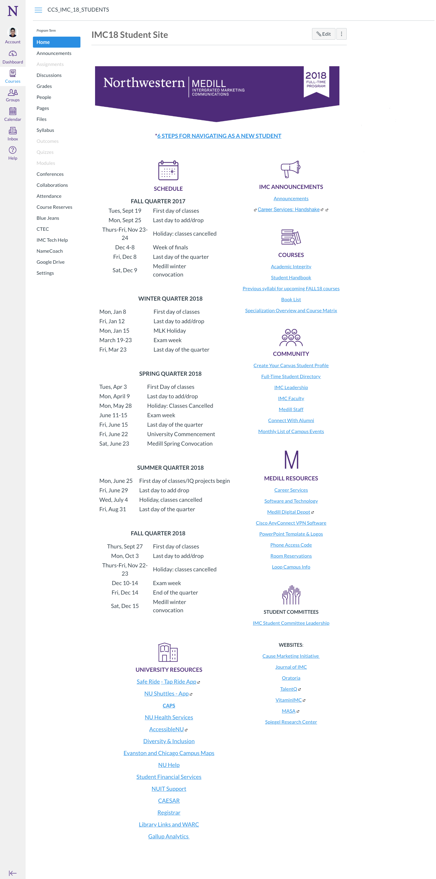
Screenshot of the Canvas-site when I began
As is evident in the screenshot above, the original student site was basically a mega-menu style of a page. It certainly does not translate well on the mobile experience, either. On this page, and on many others, a consistent problem was information and choice overload. Even when there wasn't a ridiculous amount of information, many of the pages had little or no visual cues that made information easy to scan or skim.
I proposed that the various resources and information be spread out, even if that meant users would have a click a few more times. If at least the direction and breadcrumbs were clear, I though a limited amount of choices and information would make the experience seem more leisurely.
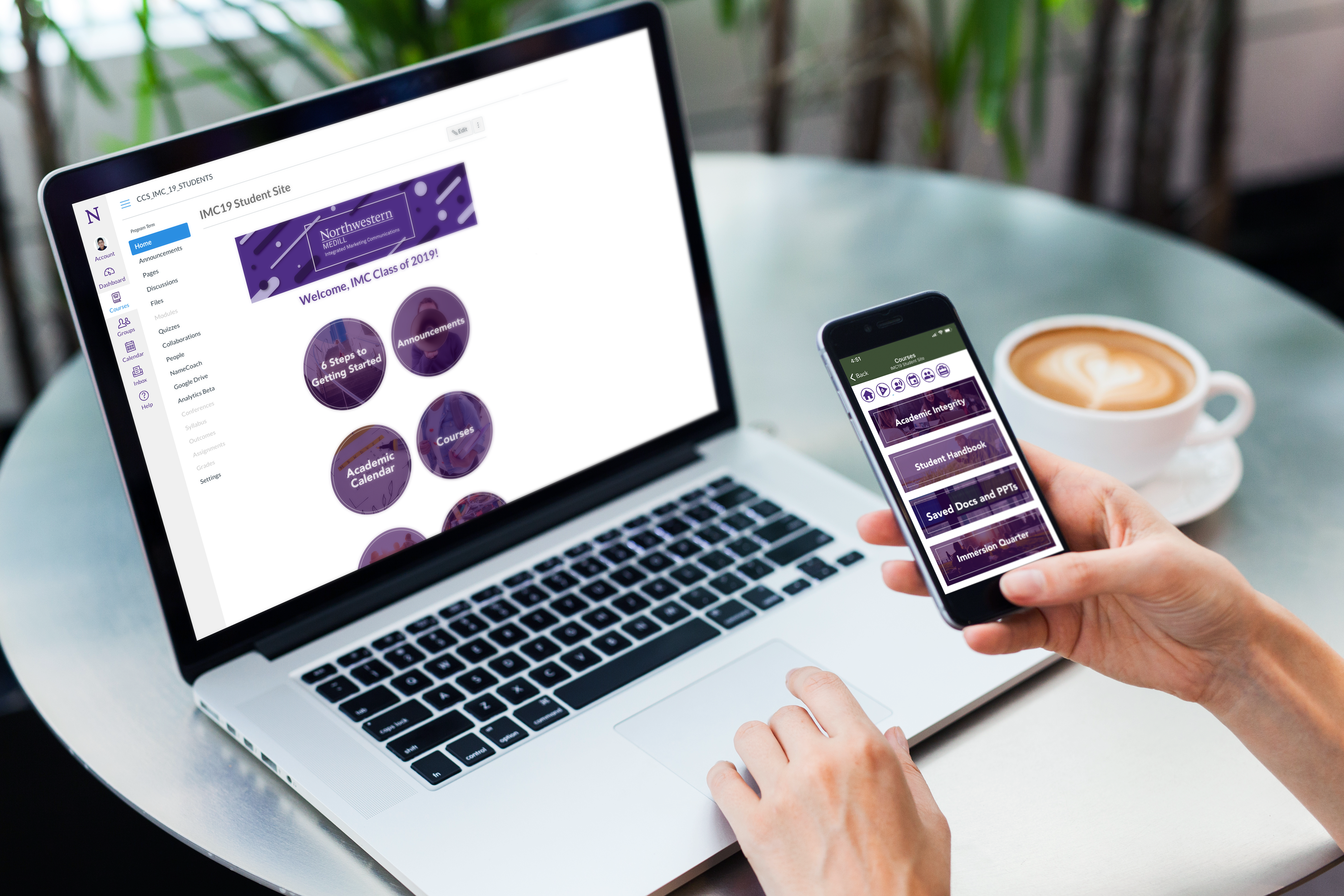
The following are a few screenshots of my design for Class of 2019.
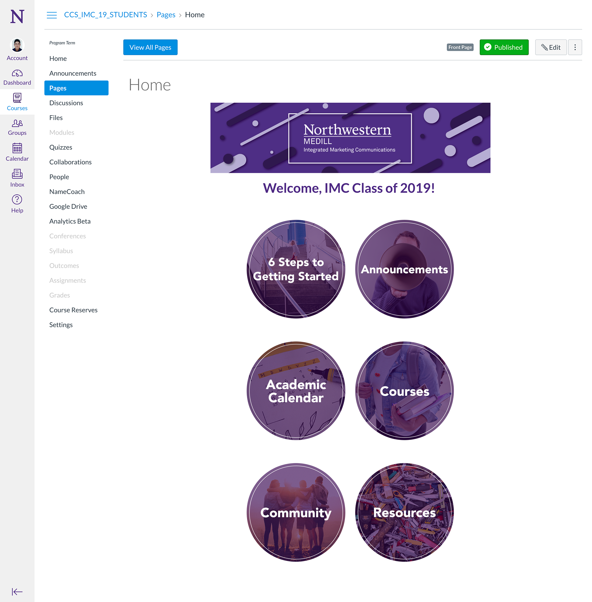
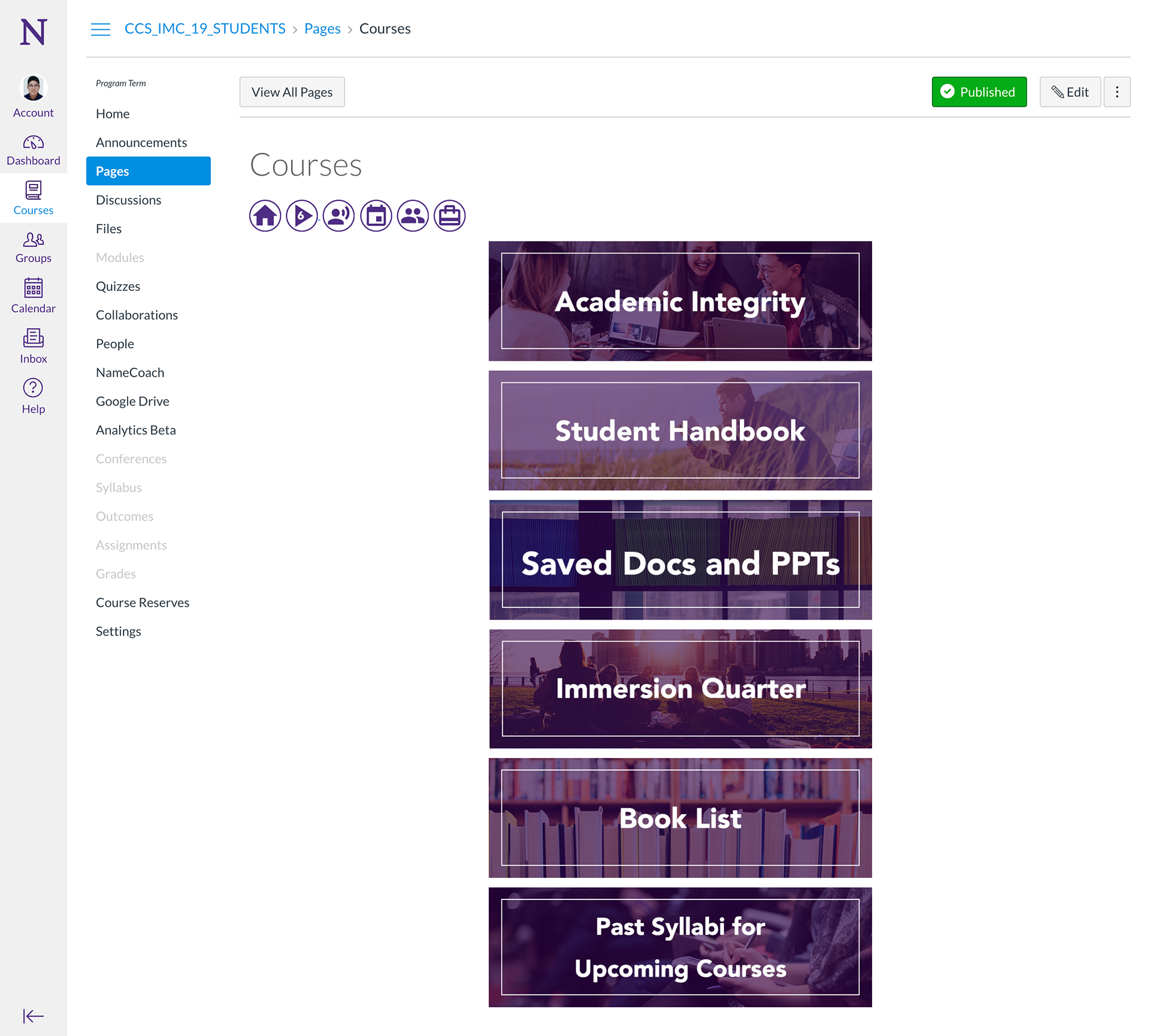
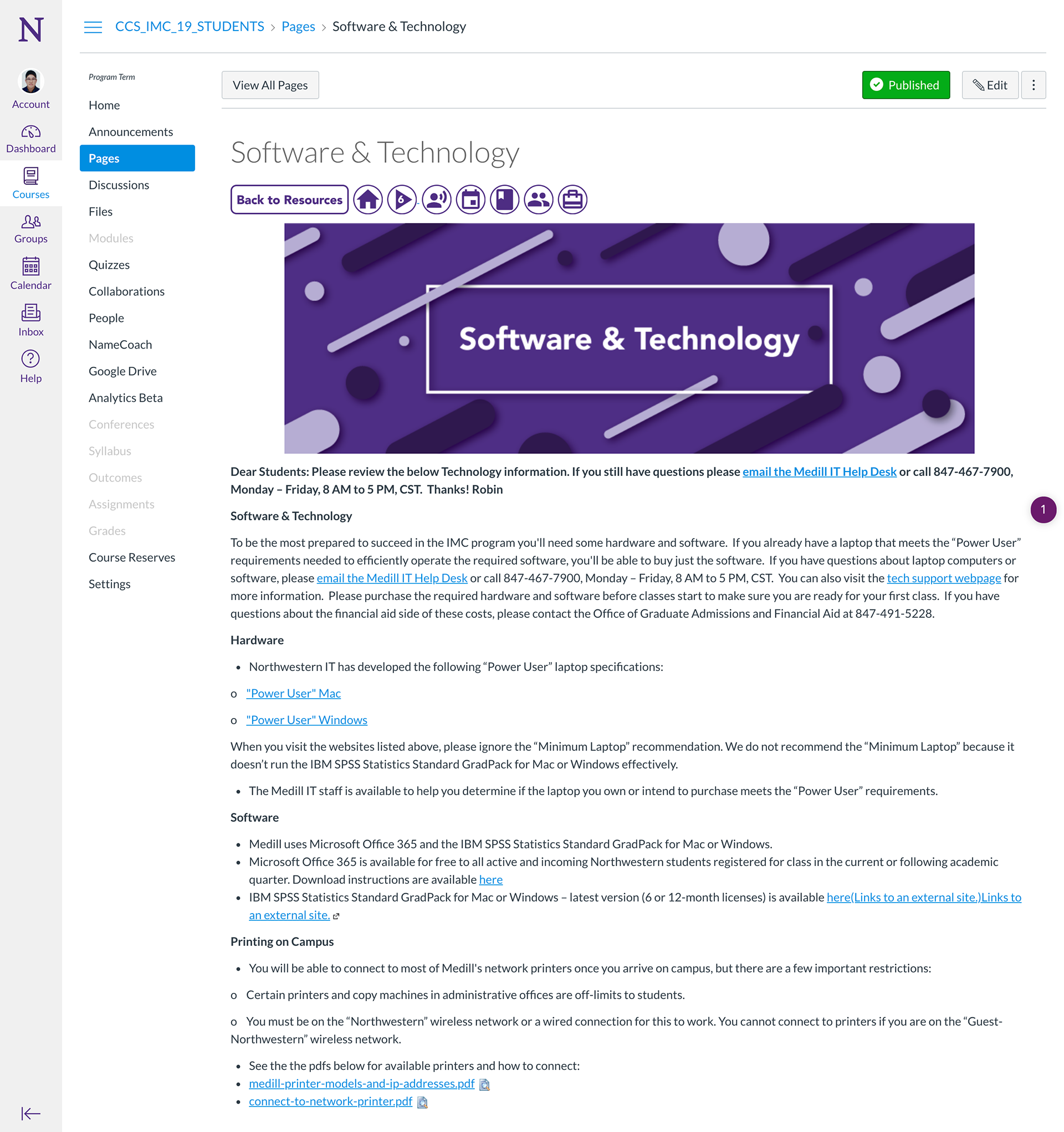
Instead of a mega-menu, I broke up the many pages and links into sections with distinctive and eye-catching graphics. Until you found what you needed, users would click through buttons. The depth of the site organization was rarely more than 3 or 4 layers down. Pages with tons of information, such as the course booklists, I spread into pages by quarter, for example, but otherwise, most of all the information was only 3-4 clicks away. If users were to not find something where they expected, I created a jerry-rigged navigation bar of icons and back buttons that let users retrace their steps up and down the site as needed. I hoped this would allow navigating through the site to be more forgiving and more welcoming to exploring.
Instead of giving users all the option all at once, I hoped creating an experience that made it seem like users discovered things they needed on their own would make for a more pleasant and manageable one.
For this class alone, page views at the start of the academic year (month of September) for full-time IMC students jumped from about 13,500 in 2017 to 26,000 in 2018, nearly double year-over-year.
The administrative staff of the IMC program were so delighted with this effort that the Associate Dean commissioned me to design the pages for the part-time and online students as well as for the Class of 2020. I have since also created templated versions of these pages and graphics. I have also been commissioned to conduct a similar overhaul of the faculty support site. More than 5 other sites have also been redesigned based on my site throughout the school, including undergraduate programs.