Problem: Design researchers found that administrators struggled to accurately assign the appropriate permissions when customizing access control roles needed for their organization.
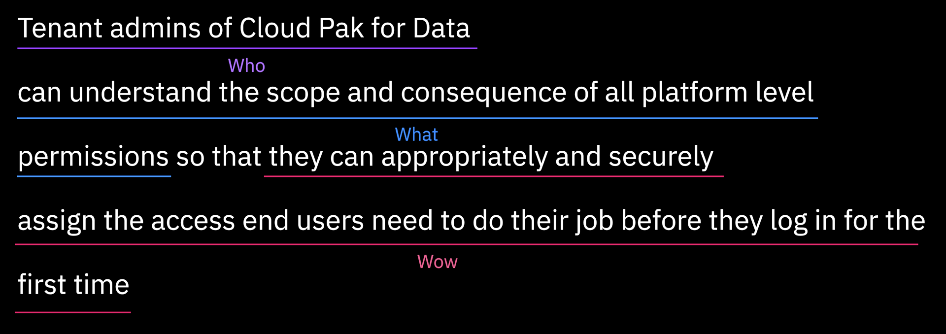
Hill: Tenant admins of Cloud Pak for Data can understand the scope and consequence of all platform-level permissions so that they can appropriately and securely assign the access end-users need to do their job before they log-in for the first time.
Role: Content designer – CPD Access control (user management) design squad
Key contributions: Critique and analysis of UI and architecture; audit of permissions (UI impact and content); co-development of permission browsing and selecting pattern; UX-writing for create user, create role, and create group flows including empty states, warning/error dialogs, feedback notifications; copy-writing/editing for permissions content and coordination with documentation topic owners.
Outcome: [Cloud Pak for Data 4.0 (on-premises software)]The experience for roles—inclusive of creating, modifying, assigning, and viewing—was redesigned. Adding and viewing user profiles was enhanced. The experience for user groups—inclusive of creating, modifying, assigning, and viewing—was newly introduced.
Impact: Post-release usability study results showed significant improvements in user success rates. The object-browser pattern was newly developed. Guidelines going forward for introducing and designing platform permissions were defined. Documentation for permissions were clarified and enhanced. The Cloud Pak for Data role-based access control (RBAC) architecture was integrated as a part of common-core services to be adopted across other Cloud Paks, meaning our pattern and content system was to be adopted across the other Cloud Pak platforms.
Introduction
In October 2020, UX Researchers Corrie Kwan and Carrie Chung presented findings from their benchmark usability study for Cloud Pak for Data (ver 3.0). This study had participants that represent the product's core user personas conduct a series of key tasks. Among the tasks given to administrator participants, just one showed complete failure. None of the participants asked to create a new role were able to do so correctly.
While the poor design of the New role creation screen was a known issue, the data from the study put it in undeniably stark terms. Addressing it became a priority for the team looking towards Cloud Pak for Data v4.0.
Corrie and Carrie's analysis of their study data pointed mainly to users struggling to understand the permissions. Given the content-oriented nature of the problem, I was brought on to the Access control team to work with UX designers, Javy Wang and Ed Chatwood, to tackle this problem.
I'll get into the process of the work later but to skip ahead a bit... we came up with the following hill statement to define our goal in this work:
Hill statement the encapsulates the goal of this work.
How it was before... (User Management in CPD v3.5)
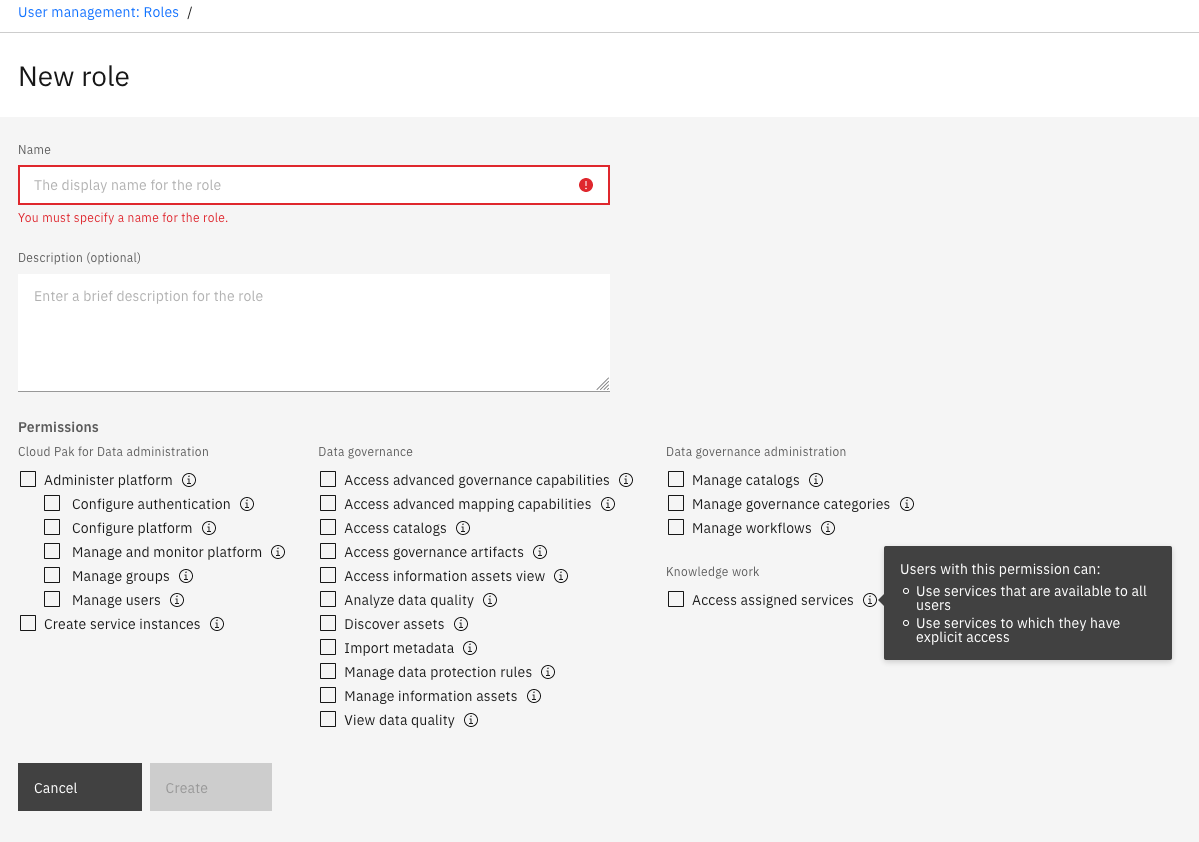
The New role page as it was until Cloud Pak for Data ver. 3.5
Cloud Pak for Data manages user privileges and restricts authorizations through a role-based access control (RBAC) approach. Roles, in this context, are basically bundles of permissions. Permissions are the units of defined policies that actually impart privileges to a user. Therefore, roles are the mechanisms for attributing sets of permissions to users. The main advantages of such an approach are that permissions can be bundled in ways that reflect a given organization's security structures. Also, since a modified role will apply to all users assigned that role, access can be controlled widely and much more conveniently.
An important factor in understanding Cloud Pak for Data's RBAC is that the permissions are also a set of bundled privileges. One advantage is that, instead of asking the user to handle the complicated and error-prone process of manually bundling individual policies—such as creating, reading, updating or deleting (CRUD)—permissions are pre-grouped policies according to use-cases. For example, pre-bundling the authority to create an object with the ability to view it, edit it, and delete it, is a sensible way users don't get stuck only being able to create but not modify or delete. But as a consequence, it can be challenging to convey how each permissions is packaged if it includes numerous units of policies. Security-sensitive administrators will want to know exactly what they are giving to their end-users.
When we embarked on this work, CPD had just 22 use-case-based permissions to combine into various roles. But for its relatively condensed list, the UI was failing to be clear, easy to digest, and ensuring both accuracy and confidence.
Process
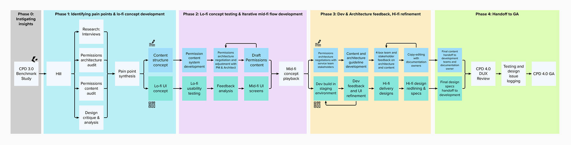
Visual overview of the Access control design team's effort in roughly 4 phases leading up to the general access to Cloud Pak for Data 4.0.
Above, you can see an overview of how we, the Access control design team, progressed through our work on this hill. Once the benchmark study kicked us off on the project, our progress can be roughly mapped to four phases of work.
First phase was about conducting research and analysis of our current experience towards identifying and prioritizing the paint points we want to address in this release. The phase concludes with low-fidelity designs and content.
The second phase centered around taking the low-fi concept to mid-fi designs. On the UI front, we did some usability testing and used what we learned there to refine the UI designs. On the content front, I took what I learned about the permissions landscape in the audits and the pain points from the user interviews to develop a content system and a draft of permissions content that exemplifies that system.
The third phase followed a playback of our mid-fi concepts, which were generally well-received. The work focused on developing, iterating, refining towards hi-fidelity design delivery. On the UI-front, things could start moving into building and refining in earnest with the developers towards hi-fi design delivery. On the content front, I spread out from the access control team to work with other stake-holding teams with permissions to confirm the accuracy of content as well as to negotiate the adjustment of permissions architecture towards being more adherent to a common system.
The final phase is mostly about outcomes after design delivery. It included a major two-week Design and UX (DUX) review, of which, our access controls was one among a few major topics. With a passing grade overall as a product team, Cloud Pak for Data 4.0 was available to customers shortly after IBM's annual Think conference in May 2021.
In the following sections, I'll highlight some key details from the project across the phases.
Identifying pain points
The first phase focused on conducting interviews, audits, and detailed critique of the current UI and content to identify the key pain points to solve for. We would then synthesize and prioritize those with product managers, development, and architects towards designing an initial low-fidelity concept.
With a foundation of insights from Corrie and Carrie's research, and a hill to work towards, we started our efforts in earnest with our own research and analysis of what the issues and pains are in our UX.
Research: Interviews
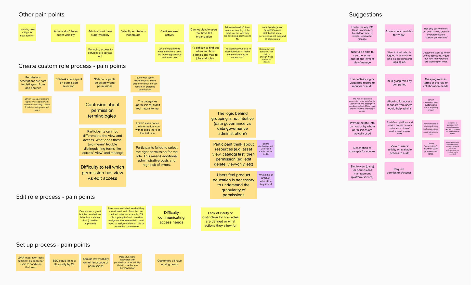
As a team, we organized interviews with sponsor users and third-party partners that help customers install and set-up their instances of Cloud Pak for Data (these later folks are tightly in-tune with what system administrators struggle with). The above screenshots show the pains and suggestions these users were able to share with us that we collected onto a Mural board.
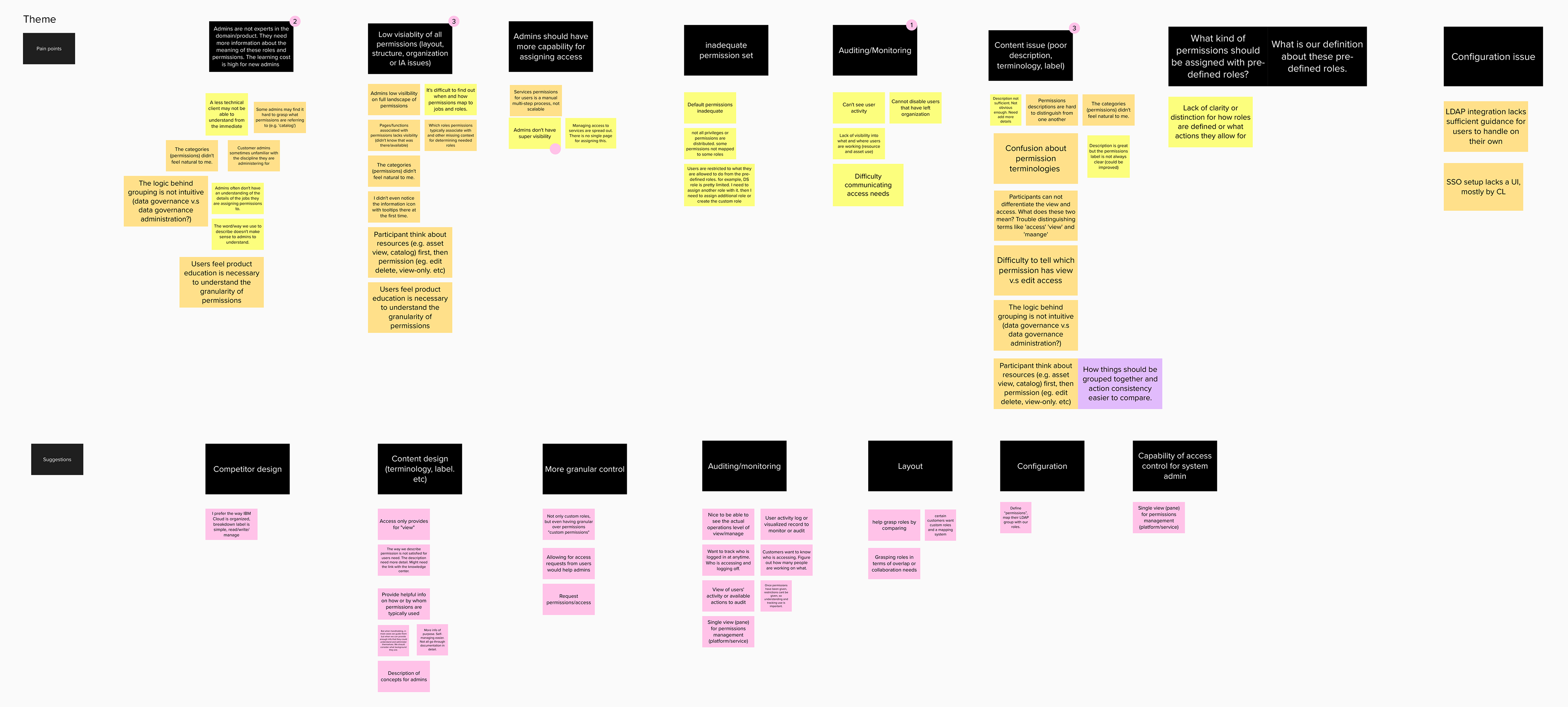
We then sorted the extracted points into key theme areas. These themes were then reviewed with the rest of the Access control team—our design manager, developers, architect, and PM—to vote together on what we saw as attainable and high-impact priorities that we could and should target.
Research: Permissions architecture audit
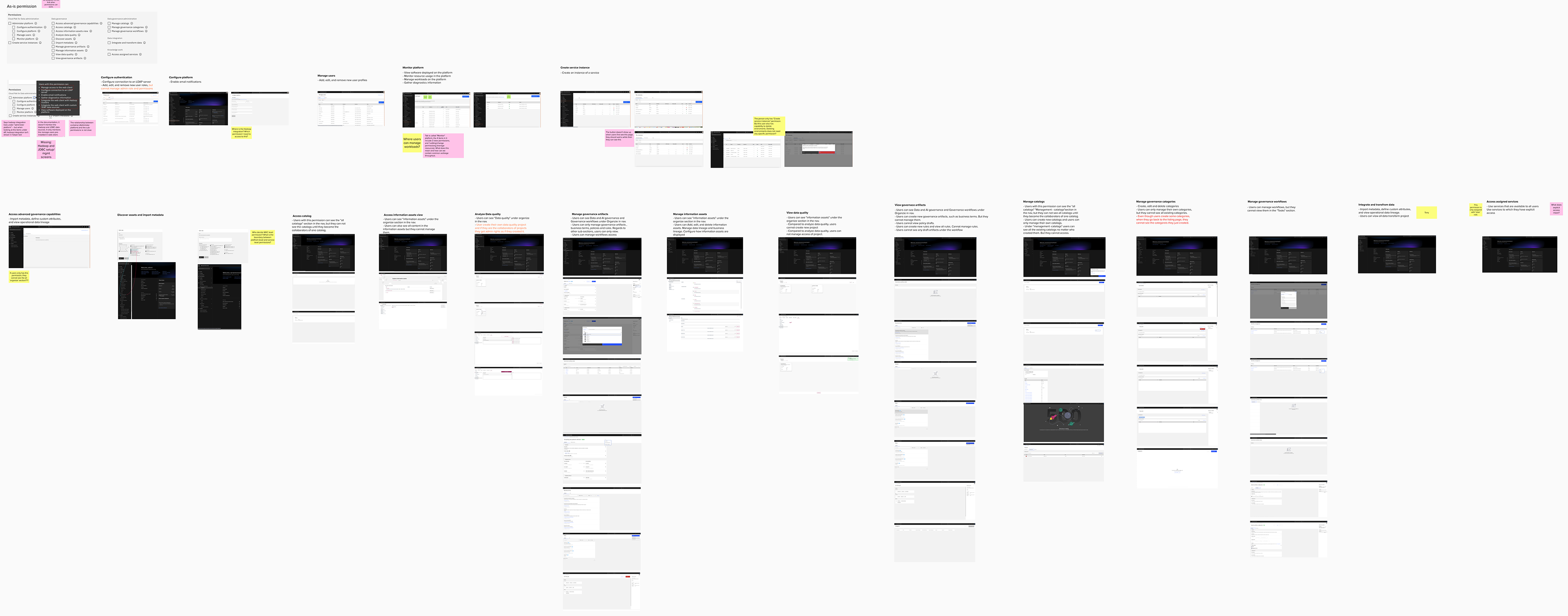
We also sought to better understand the permissions landscape we were working with, so we conducted an audit of what the permissions appeared to do in comparison to how the current UI was describing them. As you can see in the screenshot above, we used testing instance of Cloud Pak for Data and tried assigning each permission to a second account to see what changes we could observe. We recorded screenshots and noted anything that seemed missing or anything we couldn't confirm ourselves. It was from this effort that we noticed issues like a potentially critical lack of granularity and actions represented in a hierarchy of permissions.
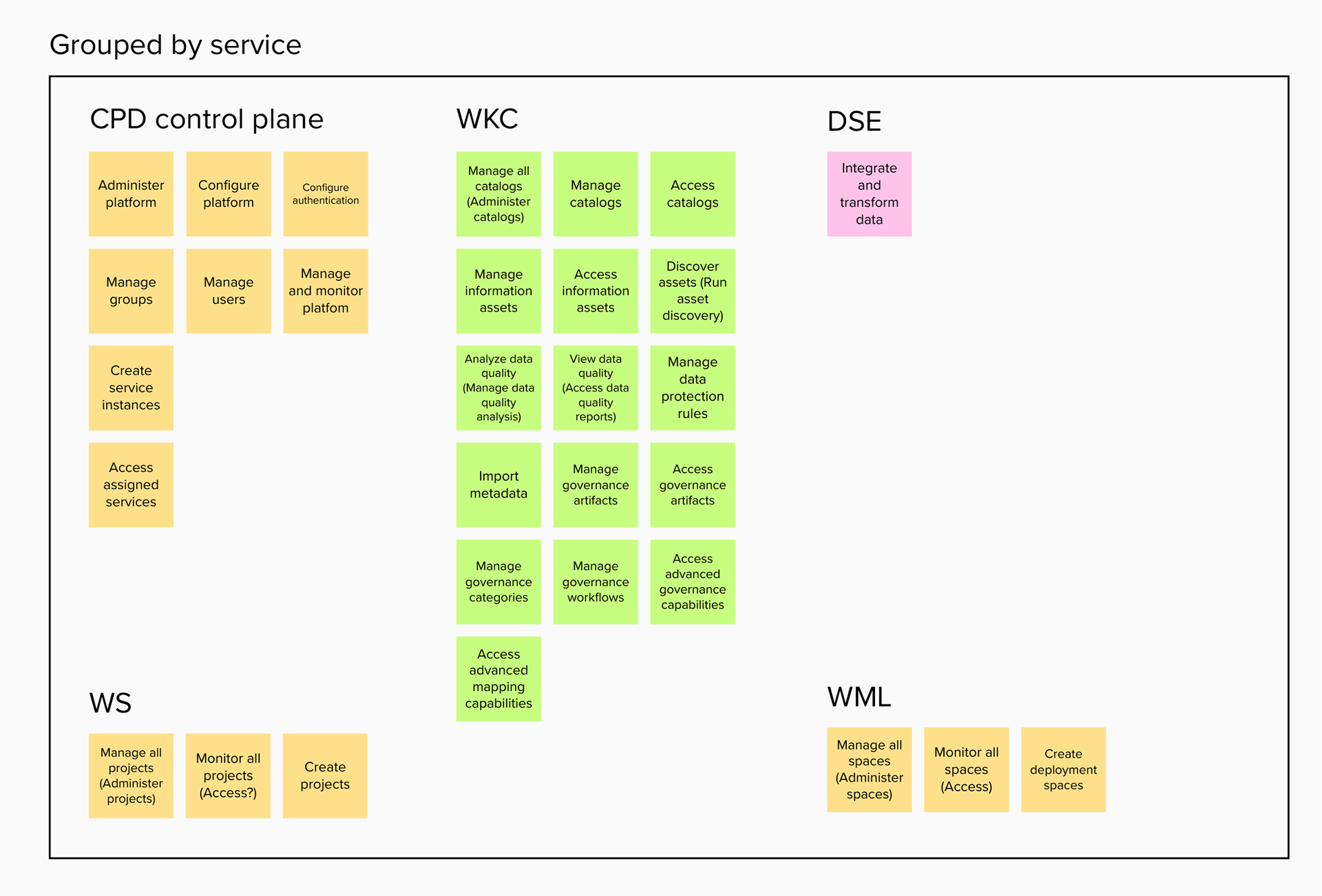
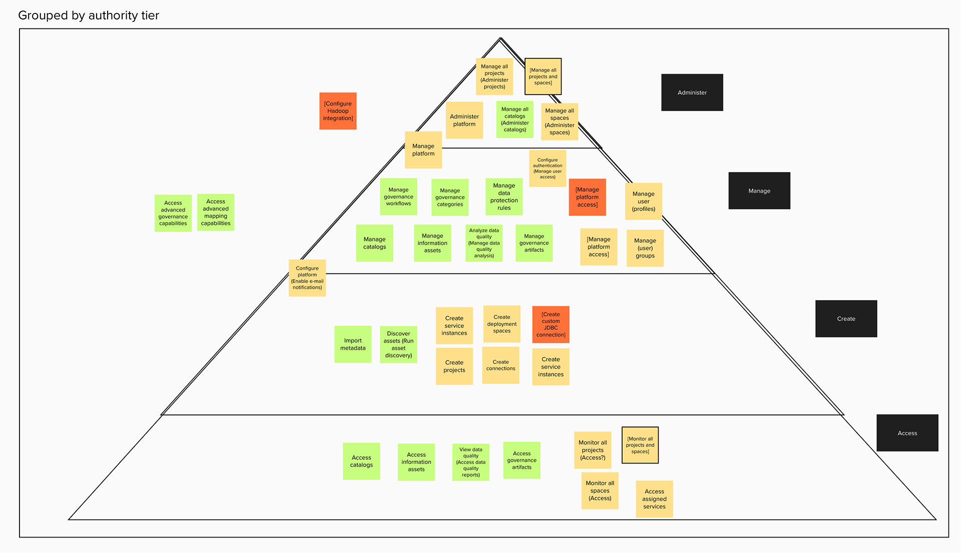
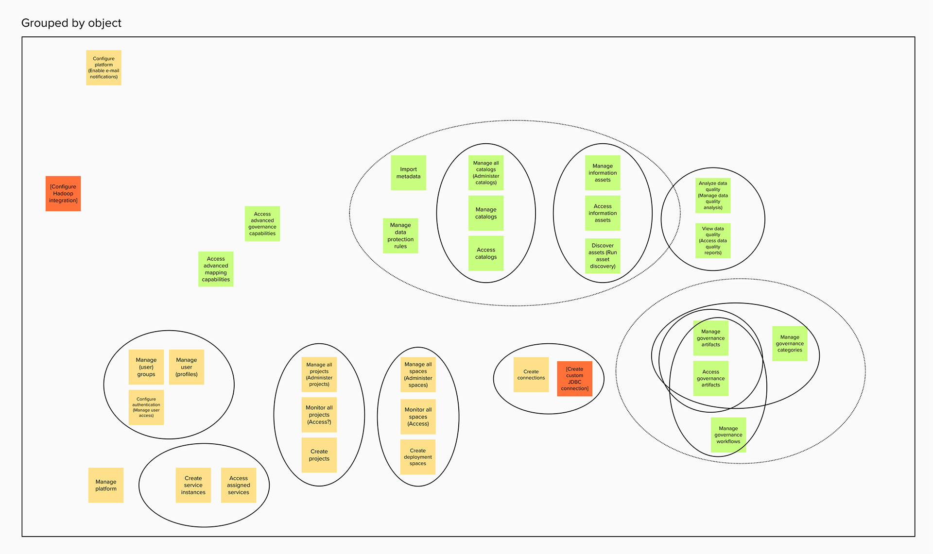
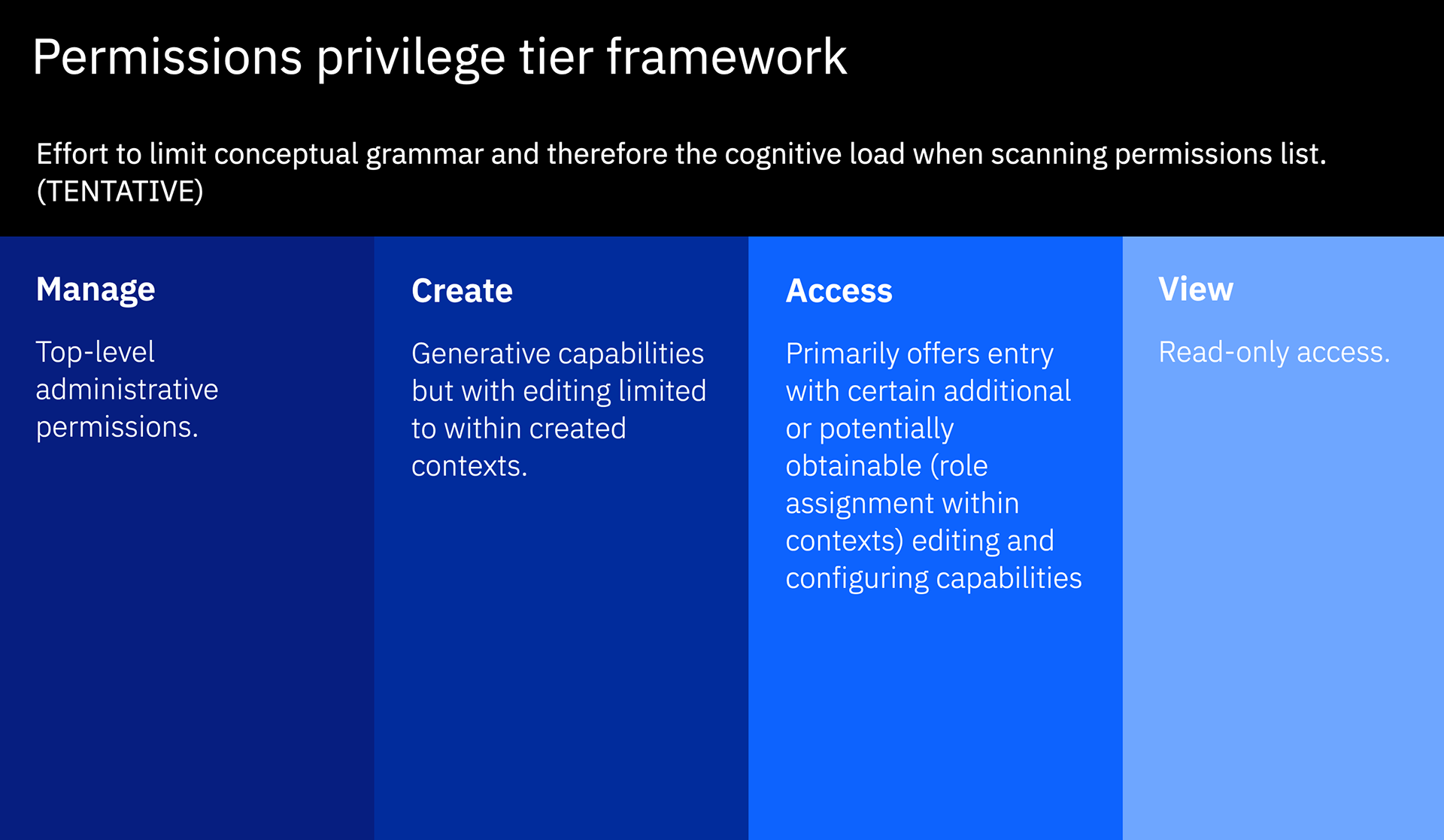
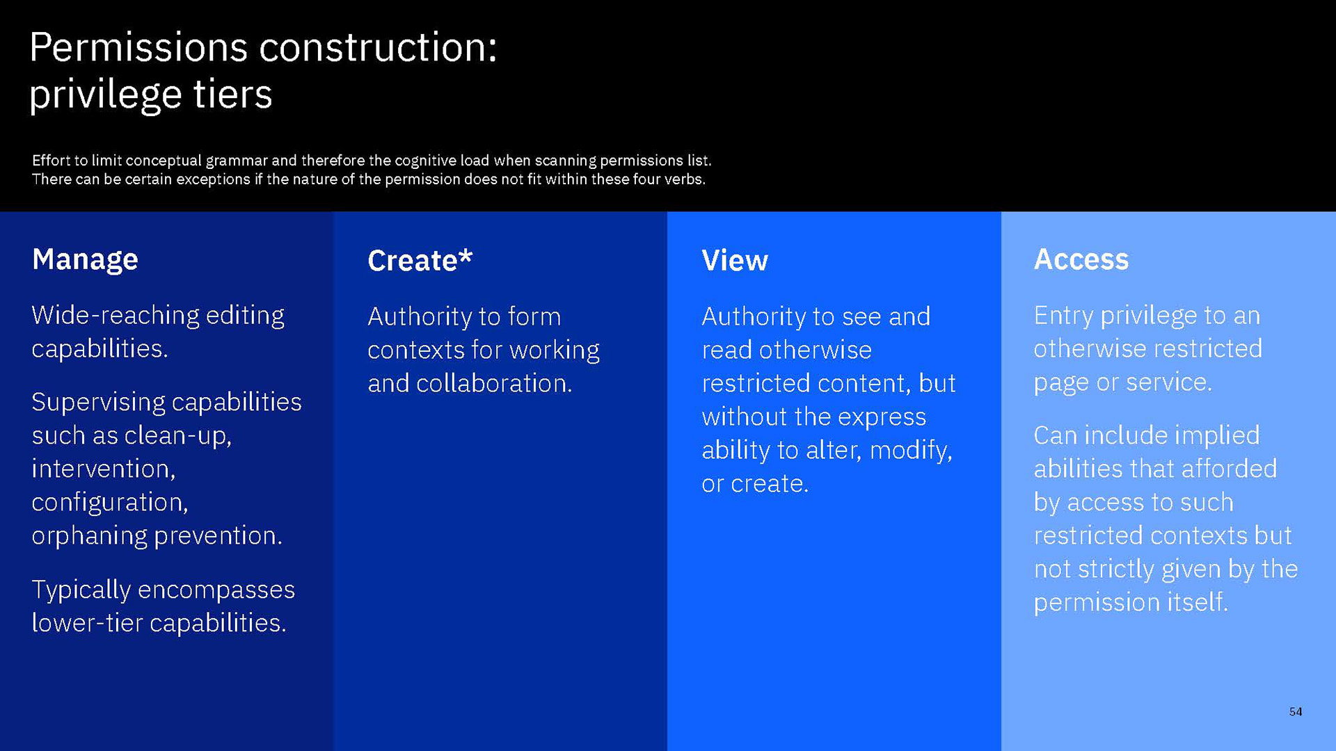
Through the exercise we also observed how permissions related to each other and mapped that as can be seen in the above set of diagrams. In the first diagram, we grouped permissions according to how they were related according to where they originated or what services they impact. The second diagram we then organized the permissions according to "authority tier," or basically by the amount of power each grants. For example, "access" is the lowest and is limited to read capabilities. Above that is a "create" tier that adds creation capabilities and update+delete capacities limited to owned objects. "Manage" is a level higher as those CRUD capabilities extend across objects created by any user. Finally, the last diagram organized permissions according to the common range of objects or domain.
Research: Permissions content audit
I conducted an additional audit of our permissions content. I extracted all the permissions labels and listed description bullet lists from the UI as well as the additional notes listed in documentation. First, I analyzed the verbs, objects and modifiers and mapped the breadth of the conceptual grammar our current permissions had laid out for users. When only looking at permission labels, we were using 12 verbs and 14 unique objects for just 22 permissions. While understanding each permission is important, we certainly were not giving users any breaks when it comes to scanning and setting useful expectations about the permissions when there's half as many verbs as there are permissions. Also, while we can't get too much more efficient with specific objects, it also certainly doesn't help when descriptions offer little explanation about what some of these objects relate to when they are the domain of end-users like data scientists and data stewards, not system administrators.
The above three efforts, as well as good old heuristics-based usability critique, led us to a range of issues that can be roughly summarized by (1) copy clarity problems, (2)convoluted permissions architecture and underbaked content to describe it, (3) layout and editorial organization problems, and (4) misuse of the tooltip component as a way to progressively disclose descriptions.
Critique 1: Clarity problems in the copy
Through additional conversations with our sponsor users we found that the terms used to label and describe permissions were making it challenging for users to understand the permissions.
Some we expected, such as the use of terms particular to IBM products or terms with specific meaning or implications from within the platform or its services. How could we expect users to know what "data protection rules" are or what the "information assets view" is?
We also realized that while CPD might be a platform for collaboration between data and AI professionals, system admins may well be unfamiliar with data science or governance concepts. The UI and content did not lend to any ways for administrators to readily learn more about what a catalog is, let alone what it means to manage them.
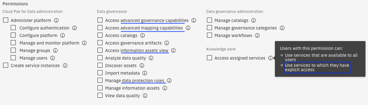
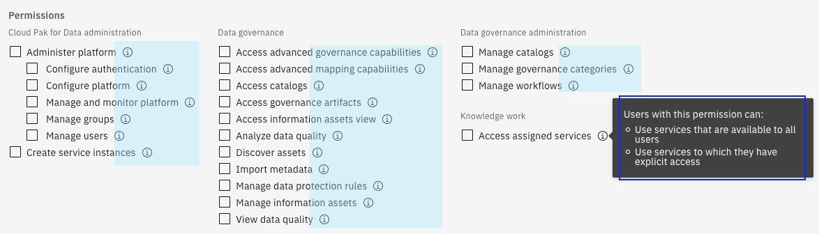
There were certainly also general clarity issues stemming from certain permissions that had policy combinations that were not narrow enough in its scope for a simple, focused label. As a result, a permission like "access advanced governance capabilities" is not nearly as self-evident as something like "Manage groups." Permissions like "Access assigned services" was strangely convoluted in its explanation when it is really just a baseline permission that might best be simply hidden from users.
I also conducted a conceptual grammar audit of the permissions, logging the objects and actions that were mentioned on this page (including tooltips). The following a simplified version showing only objects and actions used in permission labels:
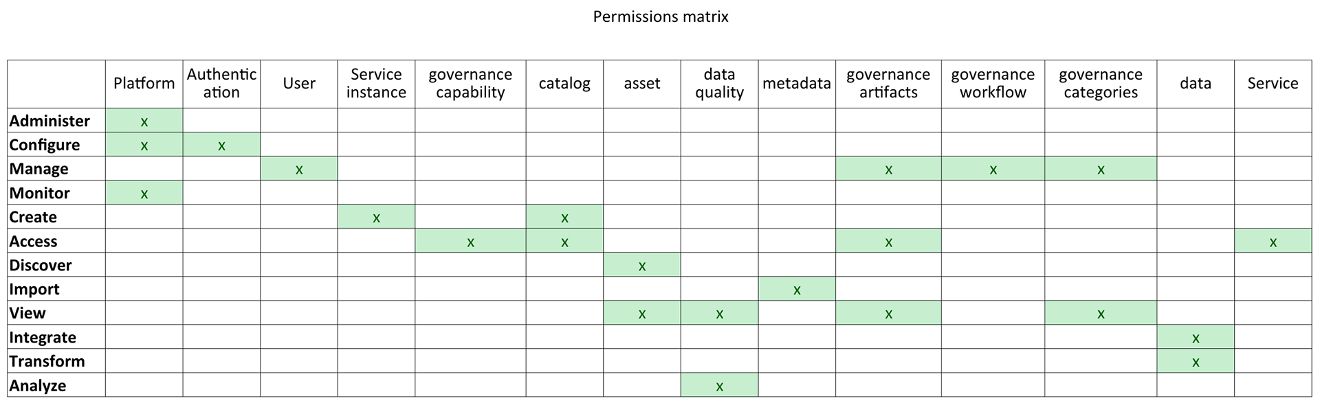
CPD platform permissions conceptual grammar matrix.
While there was only so much we could do about the objects permissions were referring to, we were using too many verbs too inconsistently.
Overall, the words we were using to label and describe our permissions appeared to be putting more cognitive load on users than was needed.
Critique 2: Convoluted permissions architecture and underserving content
In addition to problems in diction, there were substantive issues. In an effort to fully and accurately understand the impact and scope of permissions, I conducted a comprehensive audit of the permissions. I reached out to architects and developers who owned specific domains. I also used an admin user account in a test environment and tried every permission to see what changed in the navigation or what buttons would appear or disappear. And I compared it against what was described in the UI as well as in documentation.
The problems identified can be best show through a couple key examples:
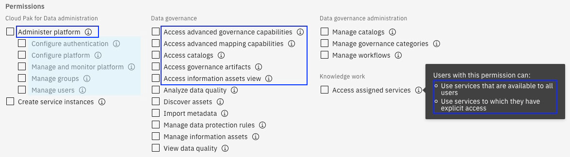
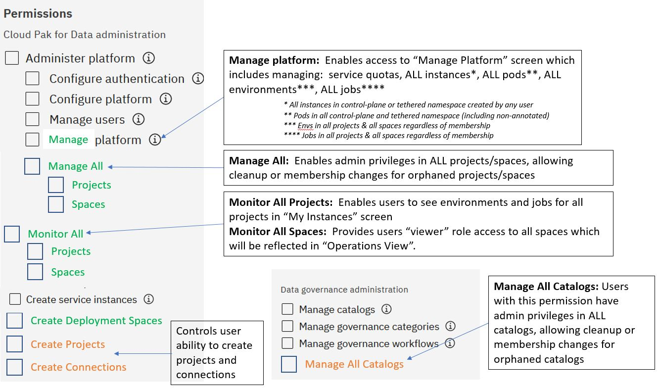
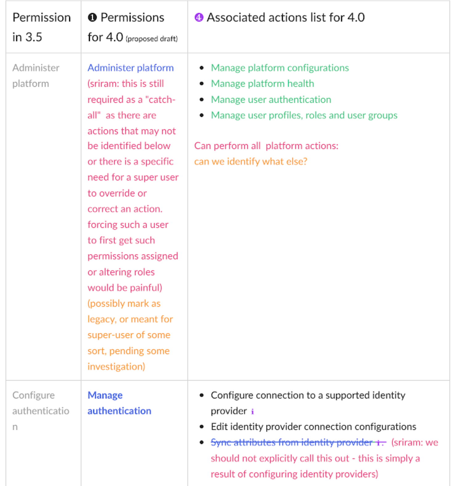
The "Administer platform" permission, for instance, is shown to be a level above five other administrative permissions. A comprehensive audit of permissions revealed that, while "Administer platform" is a superset of the privileges the rest of the five permissions encompass, it is misleading. At first, we had read the UI to understand that the higher permission was a "shell", encompassing the other permissions exactly. But in reality, there is no hierarchy. All permissions are their own individual objects. This kind of misrepresentation is especially problematic because neither its description, nor the descriptions of the supposed lower-level permissions, were exhaustive or exacting. There were authorizations and privileges specifically tied to "Administer platform" that were unspecified and not granularly represented in another permission. In a sense, "Administer platform" is a super-admin's permission, one that might need to be reserved only for certain administrators, as opposed to team managers that may well be given the authority to add users or monitor resource usage. This exemplified how the permissions were in need of clearer and more exacting presentation in the UI and in the content.
Another key example is the "Access assigned services" permission. The label and its description is confusing to understand. Through a few interviews of developers and architects, I figured out that the permission was confusing because it only makes sense from the back-end perspective. In basic terms it is the bare-minimum permission that a user would need to do anything on the platform. However, opposite to the "Administer platform" permission, it is essentially included in all other permissions. So "Access assigned services" is a permission only required if a user is to have no other permission. While it might be logical from the system's perspective that every user be explicitly assigned the baseline access policy, it didn't make sense to mention it in every permission, but it also didn't quite make sense for it to be surfaced to the user. The convoluted description was a clear sign. There were such kinds of artifacts of the system that did not necessarily make sense to a user that needed to be cleared up. Some of the permissions, such as "Access advanced governance capabilities" or "Access advanced mapping capabilities" had complications like needing a combination of the "Administer platform" to have an affect, and such were borne from needs that should not inhibit or confuse the user.
Critique 3: Editorial organization problems
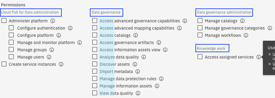
Like mentioned above, 22 permissions is certainly less to parse than dozens to hundreds of individual policy items, but it's still a lot to scan through, especially if you're having to resort to reading the specifics of the permissions. There needs to be some manner of basic organization, the same way libraries organize its catalog by author but by categories like fiction, non-fiction, and children. A basic organizing framework saves people time from looking at the wrong places.
The thing with categories is that they need to be clear, both individually, and as a group. The categories tended to be based more on how we, from the IBM-side, understood our framework of services and personas, but that doesn't necessarily apply to each customer's roles or mental-models. The resulting organization also ends up being unhelpful when a category with a vague label like "Knowledge work" has just one permission but another category like "Data governance" has nearly a dozen permissions. Some are either too specific while others are too general, barely helping users have clear signposts that narrow things down.
Another editorial organization problem was that permissions in each category were listed in alphabetical order. Given the format for permission labeling, [action] + [object], an alphabetical list had the affect of being organized by verb and then separating permissions that concerned a common object. This was in contrast to to insights we gained from our conversations with sellers and sponsor users that users tended to start with an object-oriented approach—which makes sense given that verbs can be somewhat arbitrary but the objects are the known subjects of which there might be varying tiers of privileges too.
In short, the way permissions were laid out and organized to users were neither intuitive nor supportive of their mental-models, ultimately further putting extraneous cognitive load on our users.
Critique 4: Misuse of tooltips
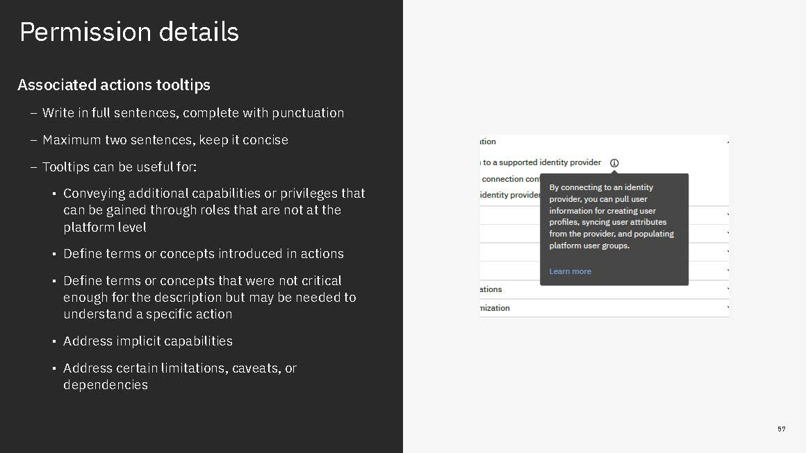
In the midst of all such issues of clarity in content and organization, it is only further exacerbated by the UI's heavy reliance on the tooltip component. The tooltip is a Carbon Design System component that offers a message box that is disclosed when a user hovers over or gives focus to a UI element. It's a commonly used component for injecting non-critical guidance or help content into the UI. A tooltip can be useful for describing concepts, offering tips or defining terms but in our UI it was being misused.
The root of the misuse issue can be boiled down to two key factors: too much content in each tooltip and too many used across the UI. The intended use case and context for tooltips are to be occasional, helpful nudges. Instead, in our UI, the tooltips were being used more as de-facto descriptions for each permission.
Starting with inside the tooltips, each features bulleted lists of access and capabilities afforded by the permission. Some of these tooltips had several bullets, some implicitly inclusive of multiple associated actions. To be a helpful nudge, tooltips need to be brief, and Carbon guidance suggests as much that they should be no more than a couple sentences. Instead, our tooltips are packed with too much information.
The need for progressive disclosure is understandable given that there is so much content describing each permission. It would be too much to include on-screen atop of the full list of permissions. But in addition to the added visual business the information icons, the interaction of clicking icons aligned to test to open each dense item in a dense list makes for a needlessly complicated way to read, understand, and compare access and capabilities across each of the permissions. The overall cognitive load for having to explore and understand the available permissions is heavy.
Synthesized and priority pain points
In collaboration with the rest of the team, we prioritized and condensed the problems into these three priority pain points:
Additional requirements
Atop of the work towards overall UX improvement through the UI, UX copy, and permissions architecture adjustment, there were a few additional factors that impacted the work. We needed to account for several new permissions that had to be introduced to the platform. Over time, some of the permissions had to be left off the roadmap for CPD v4.0 given resource constraints, but the majority were commitments and had to be considered in the development of an improved system for defining, labeling, and describing permissions.
A diagram made by Matt Walli, the Cloud Pak for Data platform team offering manager (at the time), that outlines new permissions requirements for CPD 4.0
Most of the new permissions concerned creating levels of access to the main workspaces on the platform: projects, spaces, and catalogs. Projects are mainly where users work with data to prepare and visualize data, conduct data quality work, import and enrich metadata, and build machine learning models. Spaces, are where assets ready for testing or production can be deployed, run, and monitored. Catalogs are where assets, especially data assets, are cataloged to be found and shared to be used in projects, and also as a tool for data and asset governance. Users can create any number of these workspaces and access to any of them are tightly controlled. In fact, all users are blind to other users' workspaces unless they are made collaborators. The initial goals of the requirements were to limit the creation of these workspaces and there are two parts to it. First, there was a need to control who is allowed to create any of these workspaces. And second, there was a need to allow a few system administrators the ability to see all workspaces and to either delete or reassign ownership in case the system needs pruning of orphaned workspaces or a rogue workspace unbeknownst to others recklessly or uncontrollably consumes computing resources.
One other set of permissions came from a new platform feature: vaults. Vaults store and manage secrets. A secret is basically any sort of sensitive data, usually things like credentials or API keys. For CPD v4.0, the platform was introducing both an internal vault as well as ways to integrate any external vaults to manage secrets for use on the platform, primarily credentials for creating connections to data sources. There needed to be controls on who gets to be an administrator for who gets to manage integrated vaults and the secrets they store and controls on who are allowed to share their owned secrets with other users.
To-be concepts
Structure
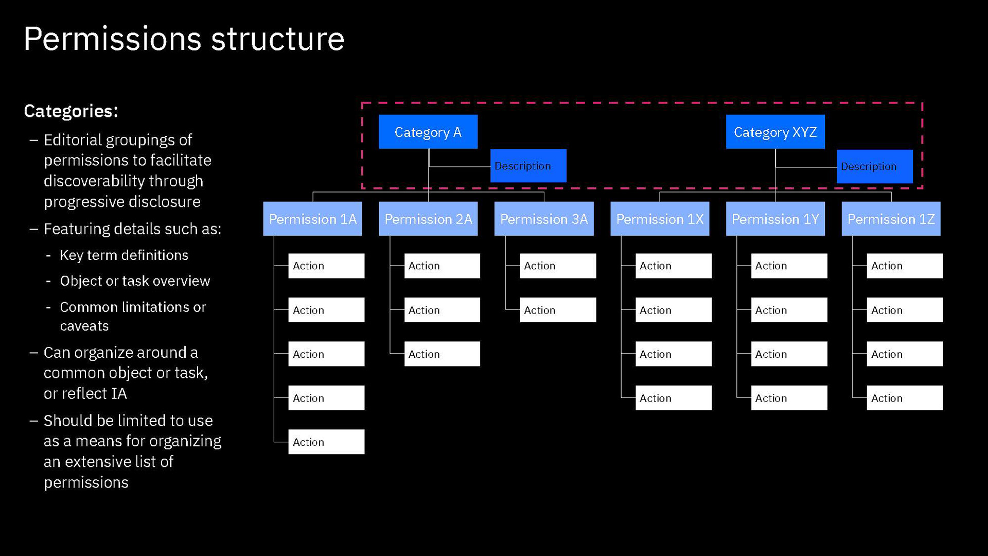
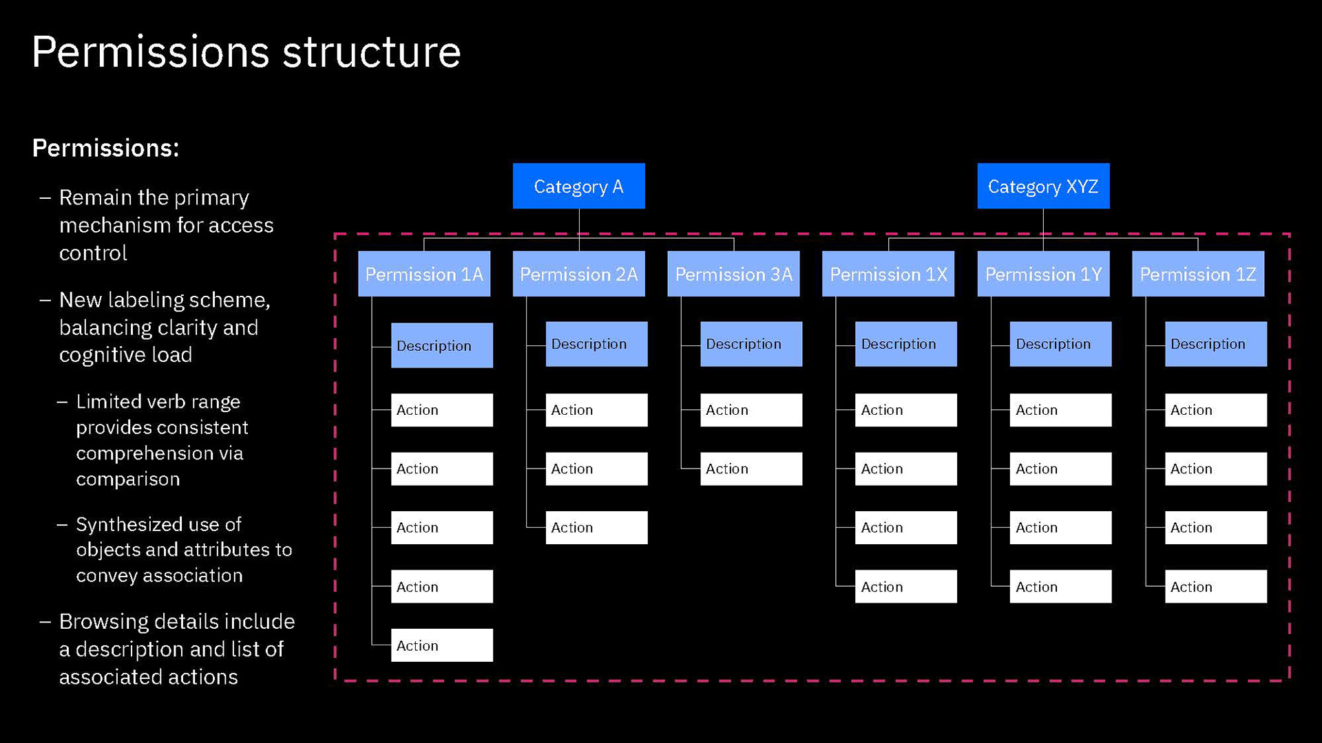
The first piece of our design concept was to establish and enforce a structure to how our permissions are organized and presented so that the UI had a basis to put into form. The structure was strongly informed by our earlier exercises in sorting and organizing the permissions according to service, authority and object.
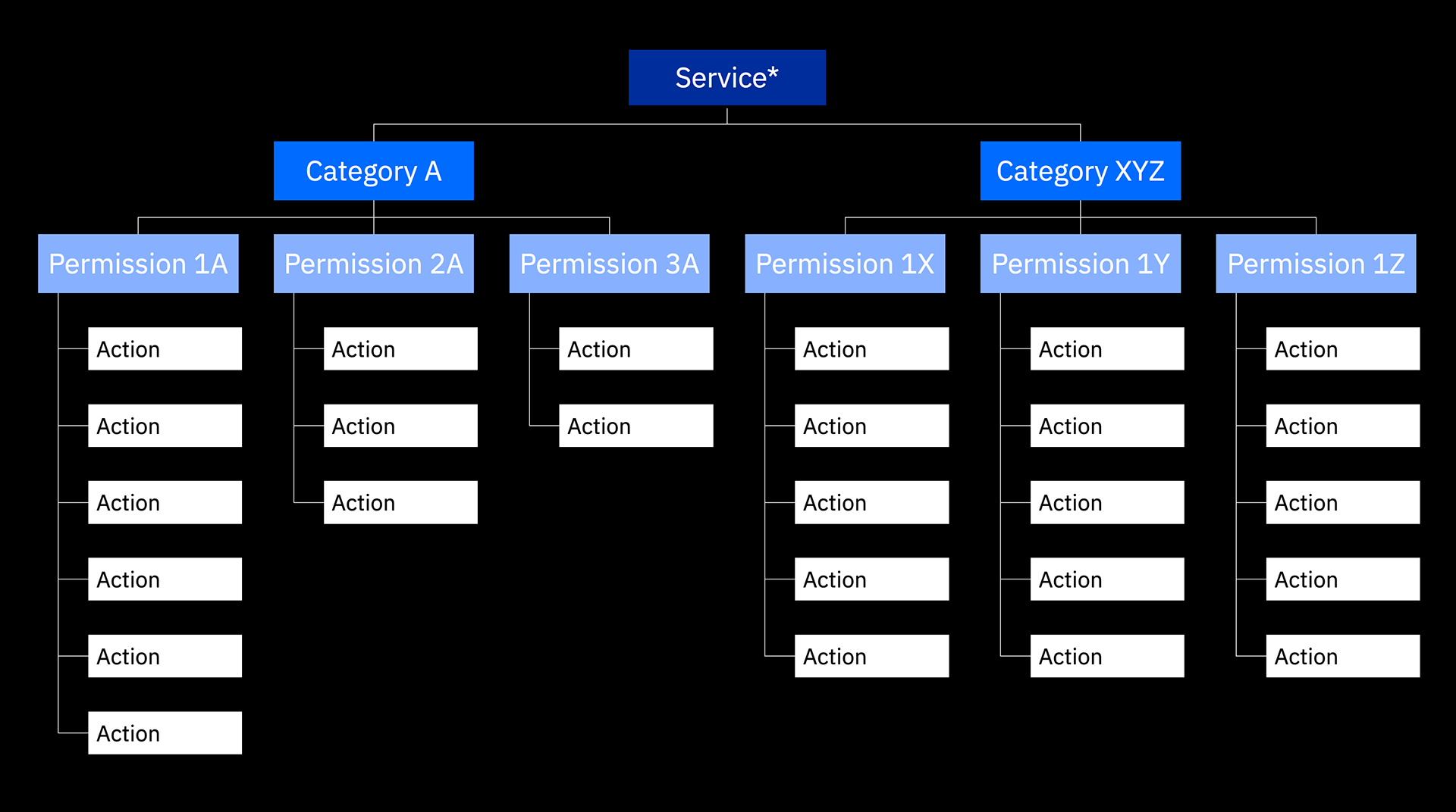
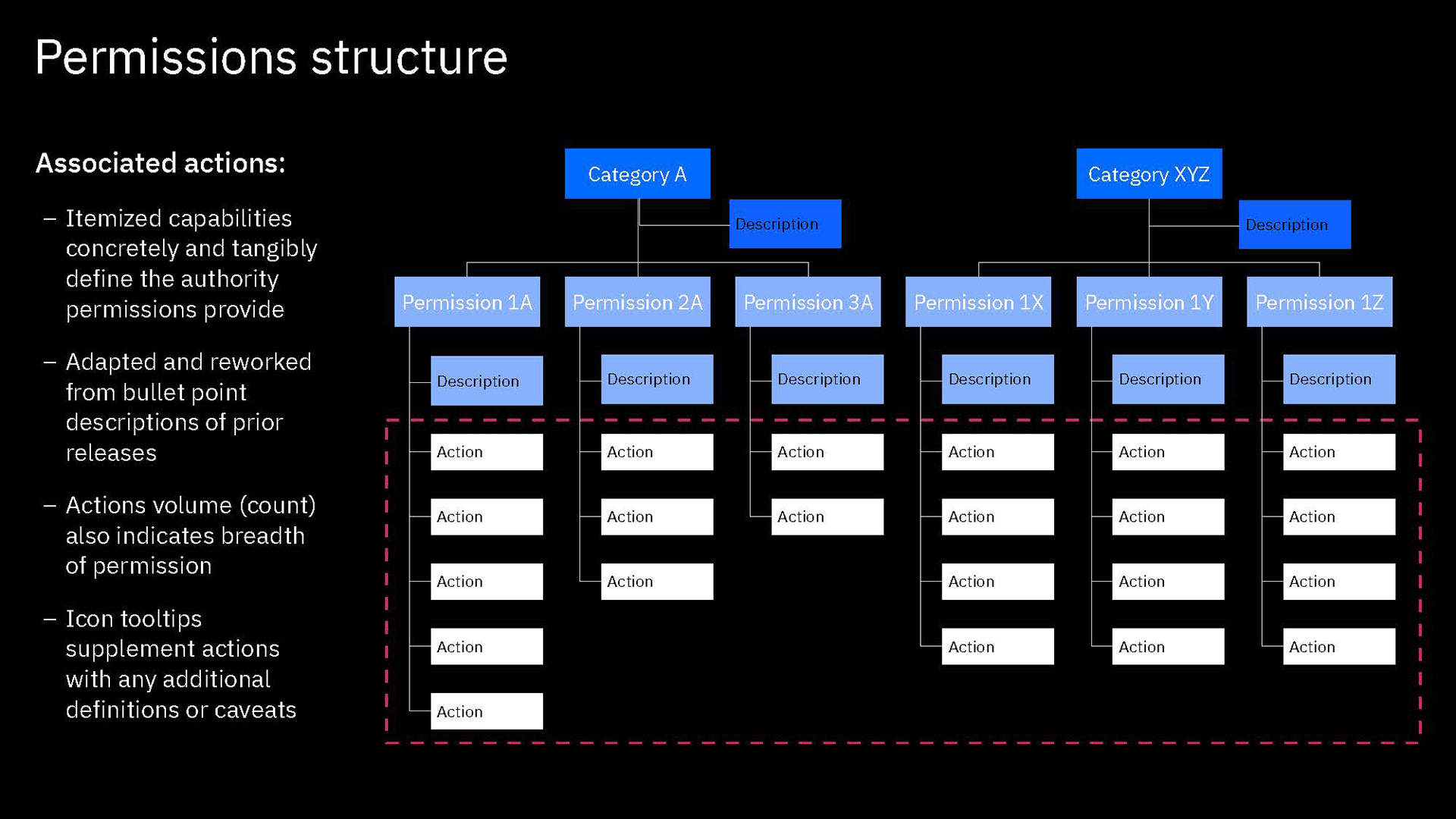
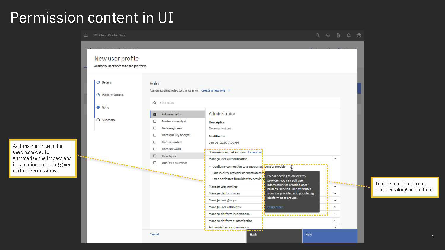
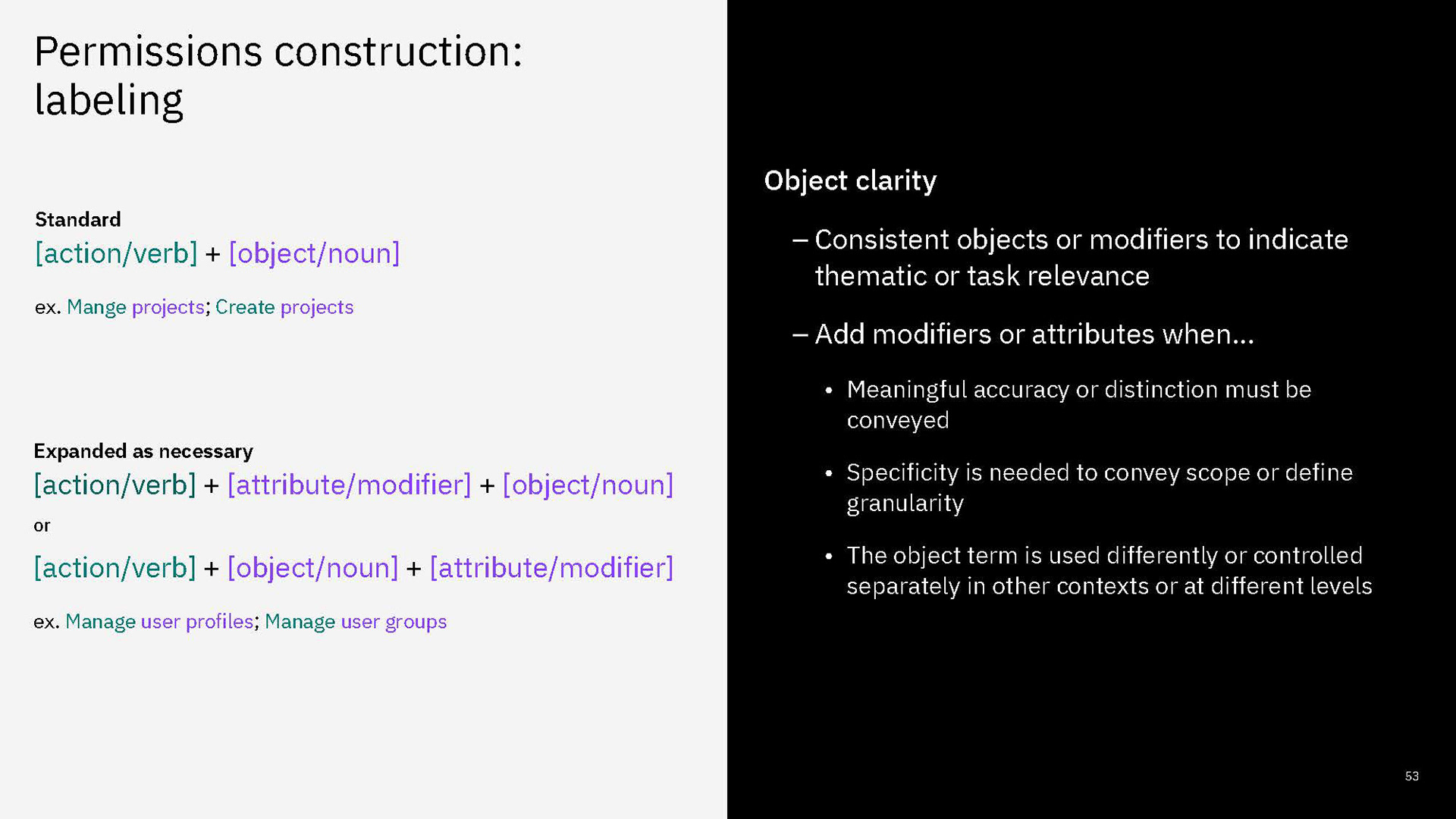
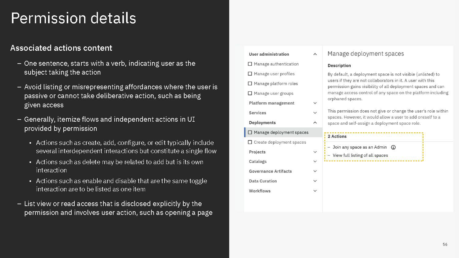
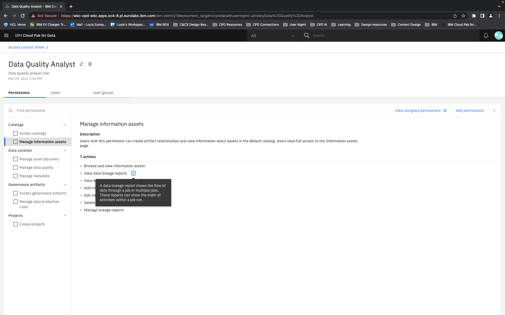
In our new structure, we introduced the concept of "actions". These are shown to users as the smallest units of privileges that compound into a bundled permission. Actions reflect the discrete capabilities that not only build up into a permission but also can be shared across permissions. They are more or less reflections of the permissions' actual composition but editorialized into easily read and understood terms.
The conception of units of actions then allowed us to define that permissions as objects should be flat in their hierarchy, as they are in the back-end. That means, even if permissions concern similar objects and some have all the same privileges and authorities and some more, or a permission is a superset of the privileges of several other permissions, they are understood and presented as individual permissions. There is no longer any confusion as to whether getting one higher permission means inheriting the lower permissions as well or not. You can get multiple permissions that overlap in their actions but that just means your actions aggregate but you get every individual permission that your are explicitly assigned.
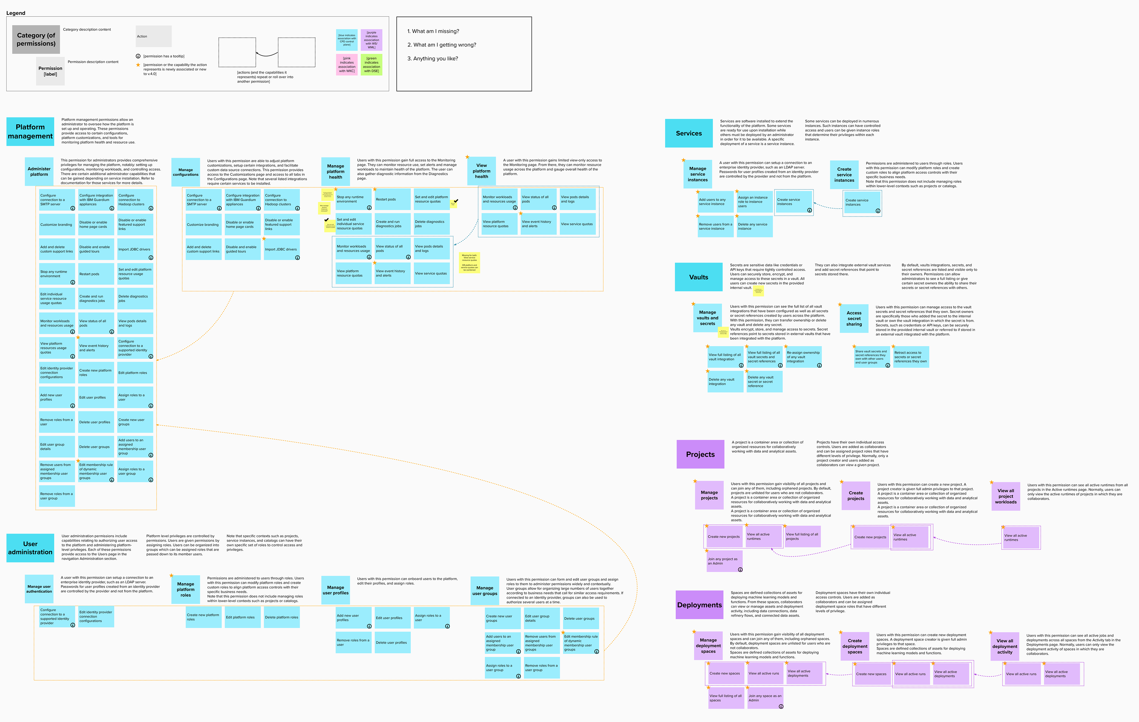
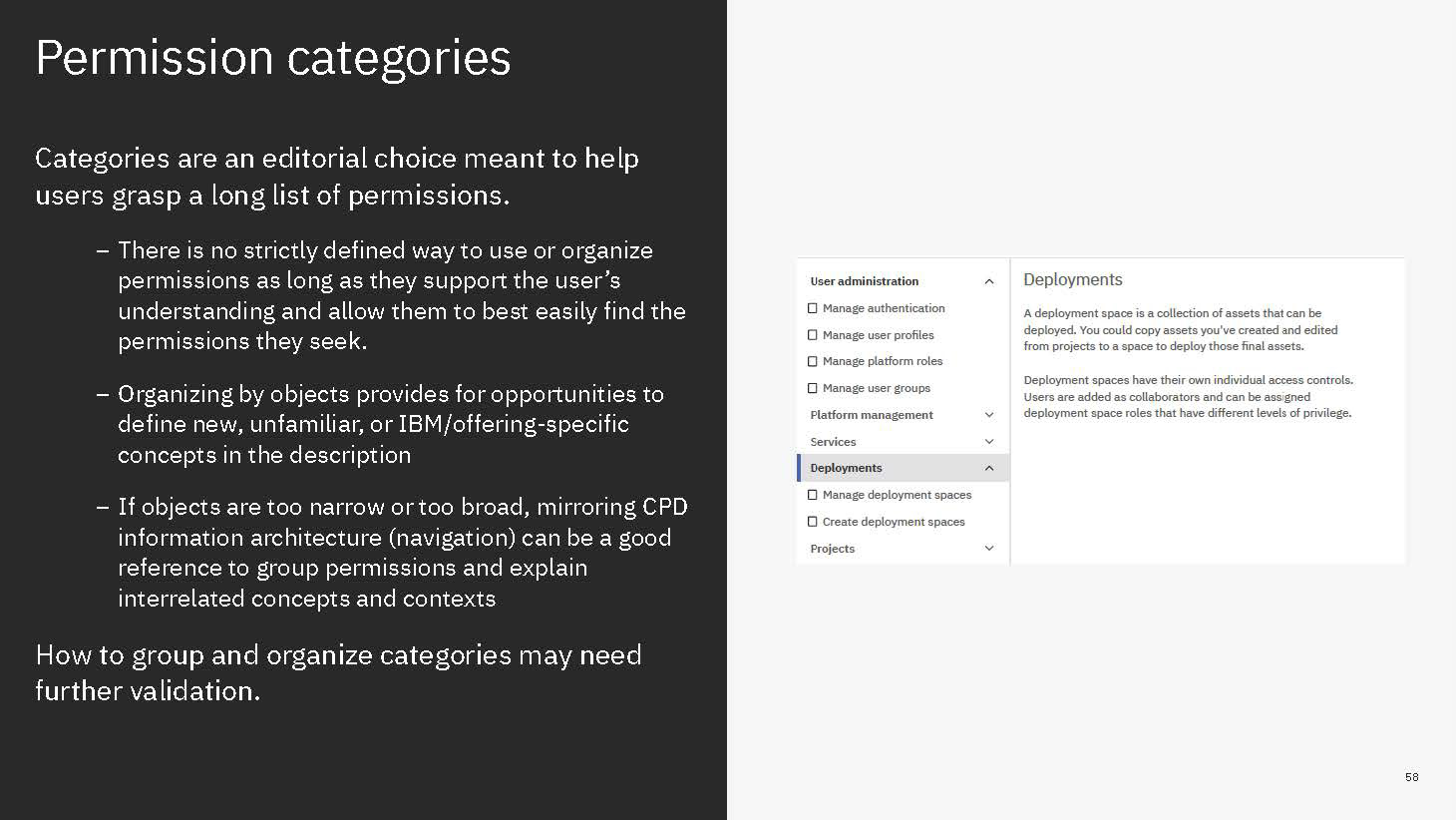
Permissions are then grouped together in categories. These categories are purely editorial and front-end content and organize permissions together by objects or by a task-theme. It allows permissions that affect common objects or domains to sit together to be found more quickly and compared more easily.
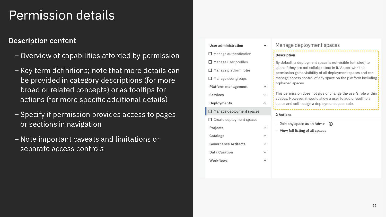
Content is mainly served at these three levels: actions, permission, and categories. Actions not only clearly list capabilities, but when some need more explanation, definitions, or have certain conditions, are appended with a tooltip to learn more. Permissions are not only a culmination of actions but also offer a description that lays out term definitions and other details about the permission that are not necessarily actions, such as authorizations that allow passive action to be taken on someone assigned a given permission. Categories not only group together permission but they also have descriptions that both offer definitions of terms but also a summary of common qualities to grouped permissions.
Moreover, sorting, filtering and searching mechanisms were thought of at each level. Some sorting would be built in: categories are a de-facto sort of permissions, permissions are sorted according to authority tier in each category, and categories are sorted alphanumerically. Search applies to category labels, permission labels, and actions. And filtering would apply by permission authority tier level and by the associate service.
Content framework
UI concept
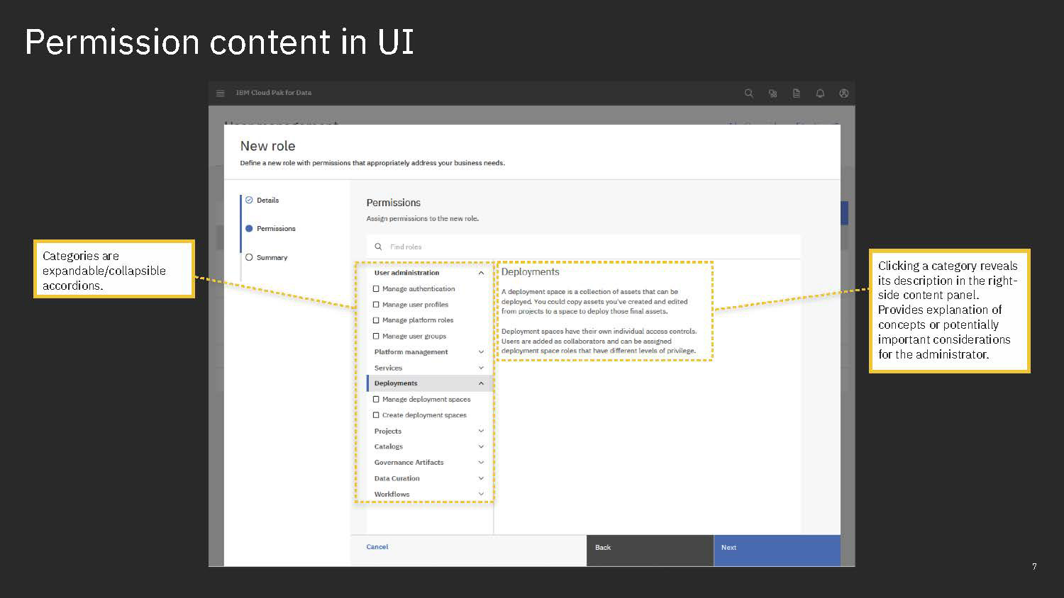
Based on the structure we were able to build an appropriate design from components in the Carbon design system. We combined pieces from data tables and a side-panel to create a pattern for browsing objects. Objects would listed in a side panel with accordions for grouping elements and a main content area that would display content pertaining to the selection.
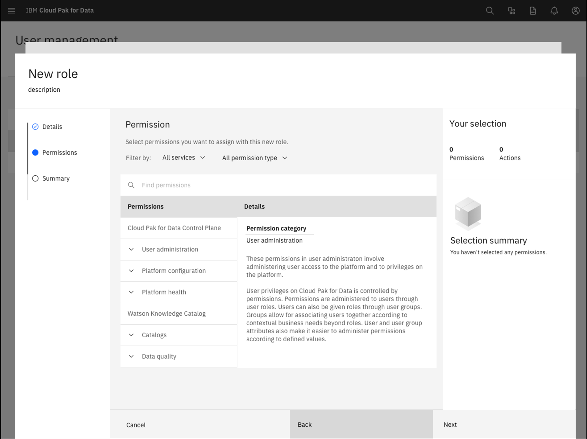
Here we show the object browser placed in middle step of creating a new role. You need to select a combo of permissions to put together into this new role. In the object browser, permissions are organized together in the left-side panel in a series of categories. Categories are also sorted into sections divided by major services.
When a category is selected, you can find content explaining the category and offering context that could help understand the permissions to be expected in the category.
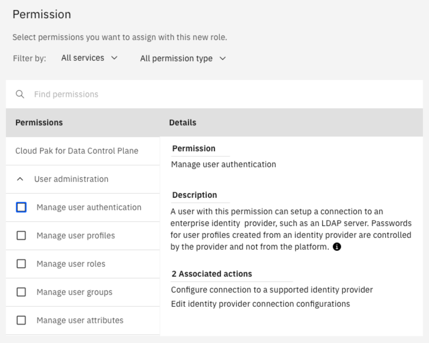
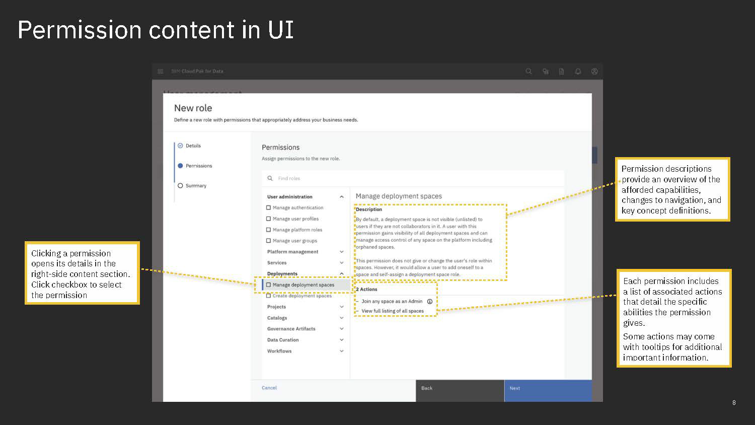
A user then clicks the category's chevron to disclose the contents of its unfurling according. A list of items with checkboxes appears, displaying the permissions in that category. A user can then click on a permission in the side panel to explore details about it that displays in the content area. It offers a description as well as list of actions.
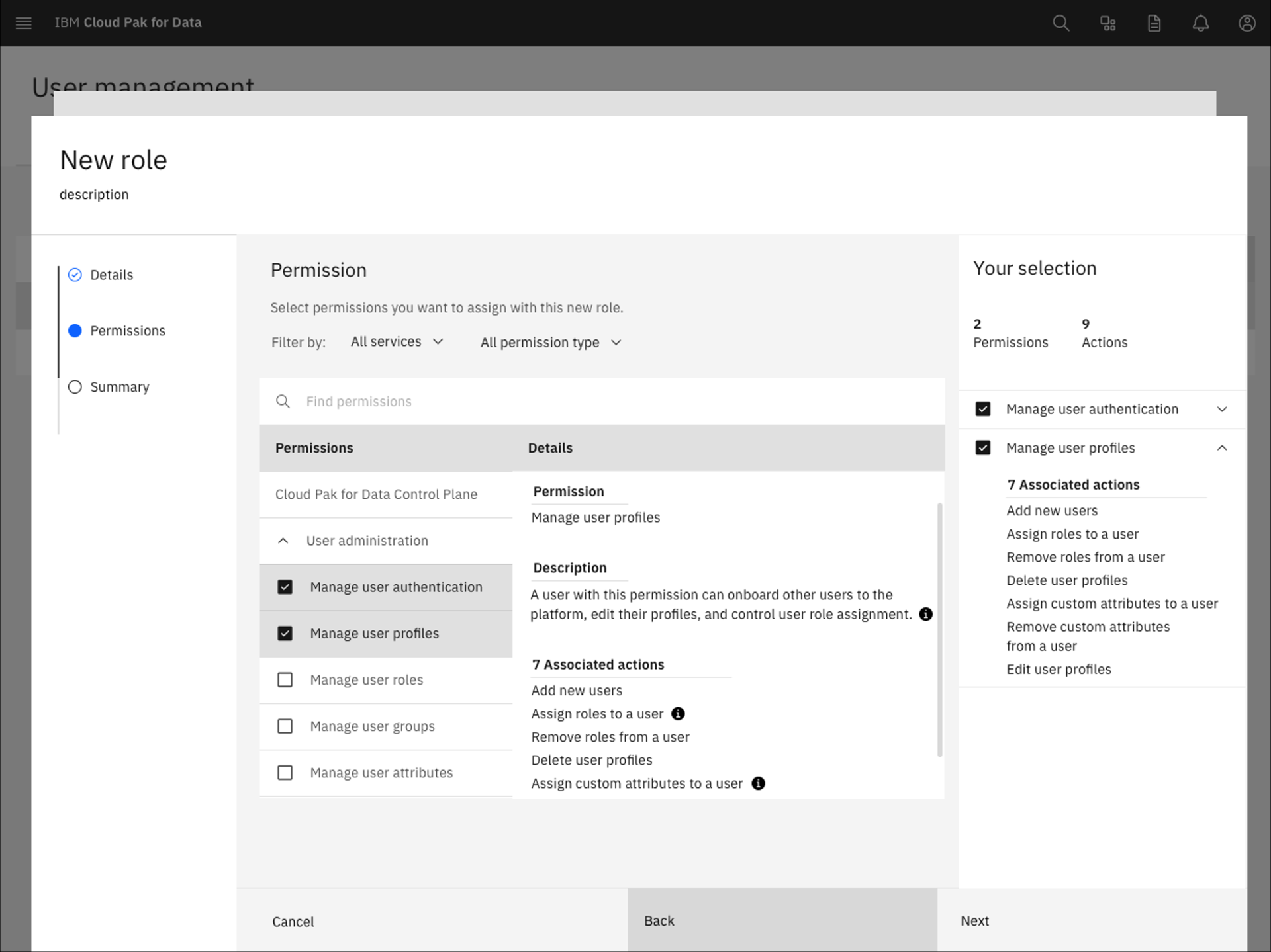
The user can explore and dig in as much as they like. When they know what they want, they can start selecting permissions by clicking their respective checkboxes. Each selection is then added to the right-hand side-panel that summarizes selections. Not only does it list your permissions but you can then understand the role you are building at a glance through the accumulating actions. Each selection in the side-panel discloses its actions and a overall counter counts the aggregate amount of actions, which also serves as a quick gauge of how "powerful" a roles is through the volume of actions.
Feedback and challenges between iterations
Feedback effort
Throughout our process, from lo-fi concepts to hi-fi delivery, our team was rigorous in seeking feedback and input. We engaged sponsor users, internal test participants, various design peers and colleagues, stakeholders, and of course, our cross-function teammates.
On the UI-front, the response was generally affirming of our intentions in the design. Study participants appreciated that they could explore and understand the permissions with ease. Internal feedback and design critiques applauded the organization and progressive disclosure of the UI. There were two major pieces of feedback that were particularly memorable.
One concerned the fallibility of trying to organize permissions by services, especially when they can be inconsistent and the confusion of referring to "common core services" that correspond to the platform's included features. Moreover, it added more layers to the object browser pattern than needed. With further detailing of our content, we also found that this wasn't as valuable or impactful so we nixed the services as an organizing section in the UI.
Another point of criticism concerned the affordance of the tiles. It was mentioned in critiques as well as a few times in our early usability tests that users were sometimes missing that selecting to add and clicking to open content wasn't very obvious to some users. We recognized this as a challenge and a point of improvement but were limited with what we could do with existing components at the time. Testing nonetheless appeared to be moderately successful so we decided to leave that as a priority item to return to.
From the content and permission architecture standpoint, I found it very challenging to get the necessary feedback that I needed. The system that I devised needed more than just a theoretical view, I needed subject-matter experts to weigh-in on how that looked in practice but the vastness of content seemed to either deter people. While I had one workroom table to draft and manage content, I tried a variety of ways to organize and display the content I wanted critical eyes on. At first, I tried to get everyone I could and tried to walk through as much as I could, starting from a birds-eye view. I was met with silence or disinterest. Then, I tried to create documents that others could explore on their own time, catered to each team. Then I tried organizing the information in different ways and on different platforms according to the discipline. For design critiques, I mapped everything onto a Mural virtual whiteboard with diagrams of stickies, color-coding according to team and pointing to where I needed the most attention. For architects and PMs, I made tables and diagrams formatted to show before and after content, questions I had in-between, begging for their annotations and focused response. It was quite possibly a bigger effort trying to get people to pay attention to content for criticism and notes than it was to draft and edit everything. Eventually, I found better strategies to engage different people and audiences and so I was fairly successful but it also spoke to how much people either didn't see the importance of content or found it overwhelming to the point of ignoring the material entirely.
It took a lot of hand-holding, and Slack nagging to get the feedback on content that I needed from stake-holders.
Iterating through resource and technical limitations
As well-received as our concept was, there were just things we couldn't do with the resources we had. As our developers built out the flows and the experience we continue to negotiate our way through to adjust what our designs could and should contain.
Some of the UI adjustments we had to make include how we had to do away with filters. That was partly due to the substance of the permissions not always quite fitting neatly into the framework as I had initially hoped and partly due to the complications of adding them to an already complex hierarchy of objects and categories.
Technical limitations and costs also forced us to deprioritize things that, we as the design team, were initially very resistant to and tried our best to retain but ultimately had to accept.
One major piece we had to table for another time was the summary panel that would show selected permissions and aggregate actions. While we argued for its importance as a way to keep a view of selections permissions persistent while the user continues to browse or add more, it was ultimately pushed to the backlog for this release as the final summary step overlapped in serving a way to confirm the users selections.
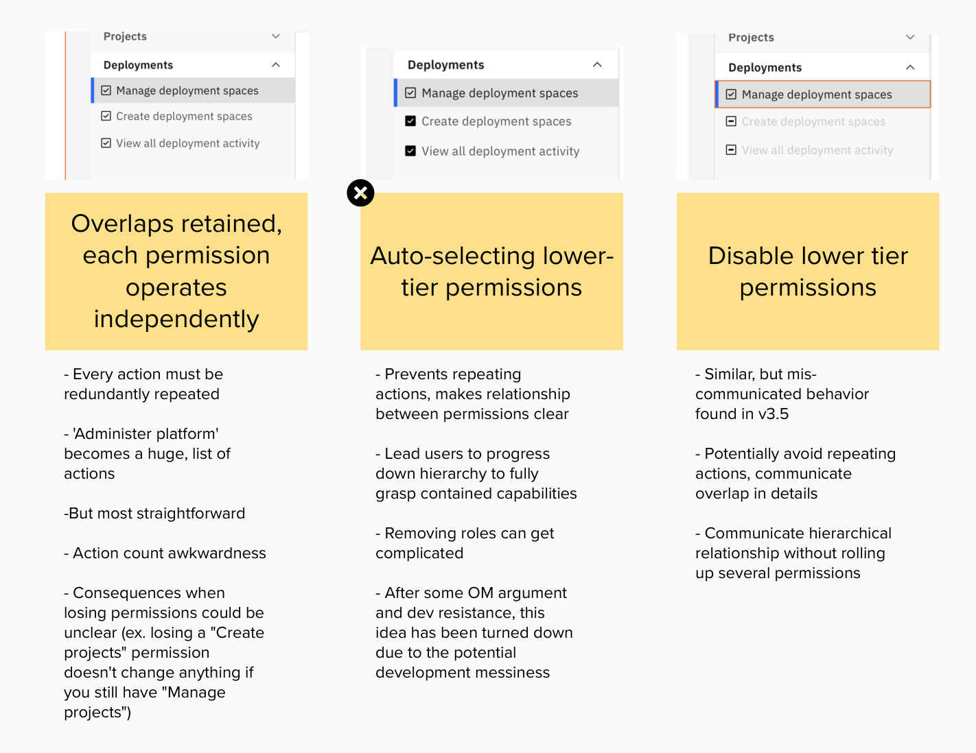
Another major aspect to the experience that we had hoped for was the design of the interactions between selecting permissions. In working with the PMs and architects, we had determined that permission should be presented as individual objects and that those representing tiers of permissions around a common object would be hierarchical (i.e. a higher-tier permission has all the capabilities of a lower-tier permission), the design team tried to come up with ways to convey those relationships through interactions. One way was to simply auto-select any lower-tier permissions if there were any. For example, the highest tier permission for spaces, Managing deployment spaces, would always also give you the lowest tier permission for spaces, View all deployment spaces. Another way was to disable any associated lower-tier permissions when a higher-tier permission is selected. The default and most simple approach would be to have no relational interactions between permissions, operating completely independently. The first auto-selecting approach was dismissed as appearing more risky than it is. The second auto-disabling approach was considered the ideal but ultimately cost in development took precedence and dictated that the last default approach.
Coordination challenges
The most challenging part of this entire effort was neither the UI nor the necessarily the content. Rather, it was coordinating between service teams that have their own priorities and roadmaps. We faced a quite a few roadblocks and obstacles trying to wrangle them to get on board with the content system and permission architecture crafted for a more holistically coherent platform experience, partly due to the resource cost some of the changes could entail and also partly due to challenges in communicating the value and importance of aligning to a platform vision.
Most of the permissions borne from the platform team were fairly easy to negotiate. Watson Studio and Watson Machine Learning teams' permissions were new to the platform this release and so they could be crafted to fit into our framework. DataStage saw only superficial and fairly trivial changes. Platform permissions for the service Watson Knowledge Catalog (WKC) however, was fraught on many fronts. Miscommunication and misunderstanding between teams and functions led not only new permissions to be undelivered but also led to frustrations implementing even relatively superficial challenges. While there were many factors at play, ultimately, the Watson Knowledge Catalog team had a packed roadmap determined and no room for the permissions Matt Walli had outlined. Both what the team could commit to as well as why it was important that they align in content structure and style seemed to had gotten lost. For weeks it had appeared to me that the WKC team had less than no objections, almost an inexplicable disinterest. It took several dogged attempts to get attention and feedback and even some QA after design delivery that something was mistaken between teams.
Permission architecture adjustments
As mentioned before, in our research and critique, we had found that some permissions had gaps and some permissions were architecturally necessary but convoluted from a user experience standpoint. While the epic laid out was about design and content, our work had a significant impact on the overall architecture of permissions. For example, we eventually were able to make the case and convince our developers that a permission like "Access assigned services" had no real actionable capabilities and is so basic to the user experience that we should hide it in the UI. In the back end, any user not explicitly assigned a permission would be automatically assigned the permission, but as far as the UX is concerned, it would appear that permissions are no longer required.
We had also successfully argued for comprehensiveness of granularity in the permission architecture. In other words, certain capabilities were exclusive to the very powerful permissions like the "Administer platform" permission when there were plenty of plausible use cases that a someone like a team manager may need. By covering the bases with lower tier permissions, the highest tier permissions could be more strictly reserved for a more specific subset of users and roles could be crafted more restrictively as necessary.
Hi-fi deliverables
Once content was reviewed with all the subject-matter experts as well as with other technical writing content designers, I organized all the content on a delivery document. The document included a breakdown of the final structure that we crafted, how that fits into the UI we designed, the content to be populated in the UI, and finally a set of guidelines for teams to reference to learn how to name permissions, how to categorize and describe them, what to list as "actions," and when to use tooltips for actions.
Permissions content
In the following slides, I laid out what each of the key elements of the content structure were organized. Moreover, I elaborated on the additional content and metadata attributed to each level. Then, I presented diagrams that show how each piece is then surfaced in the UI.
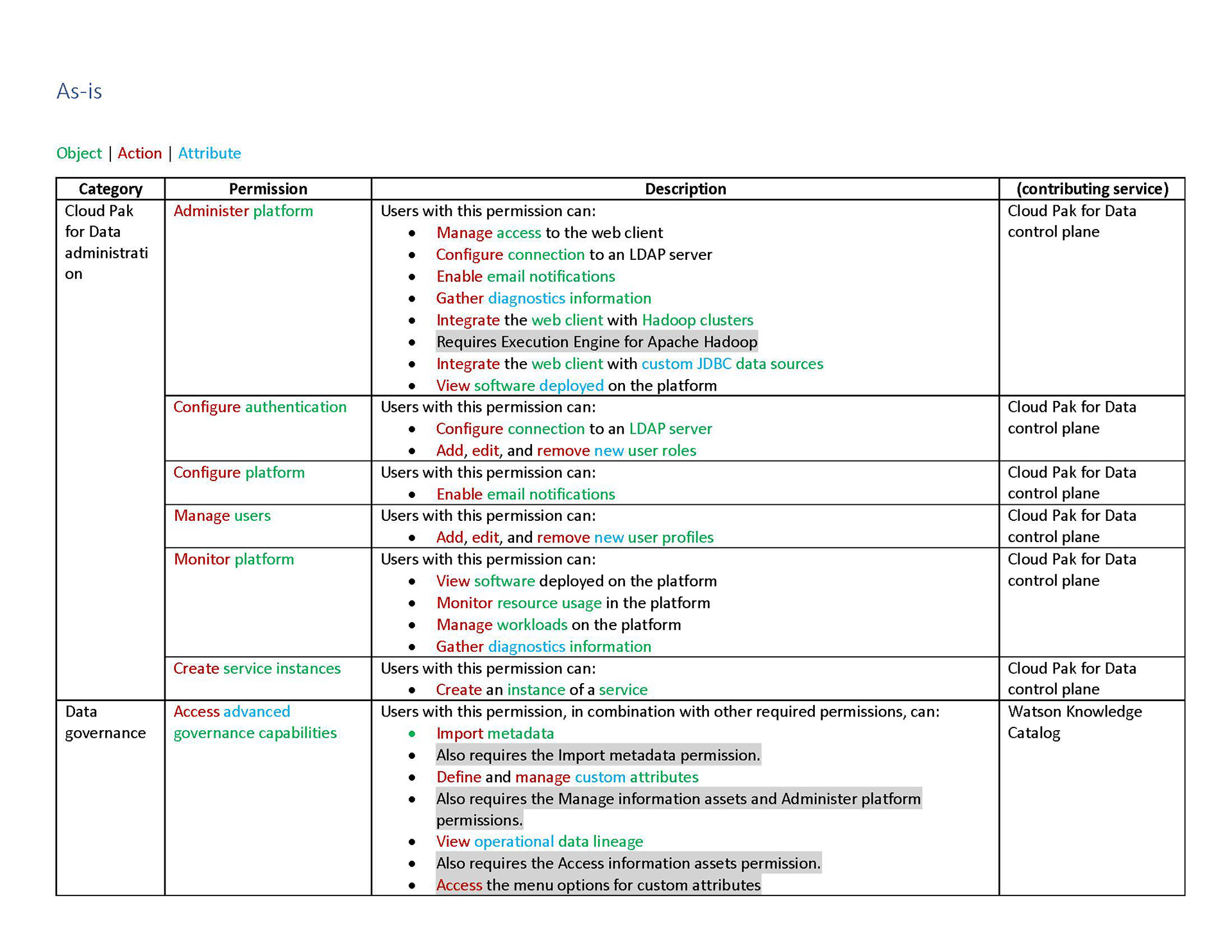
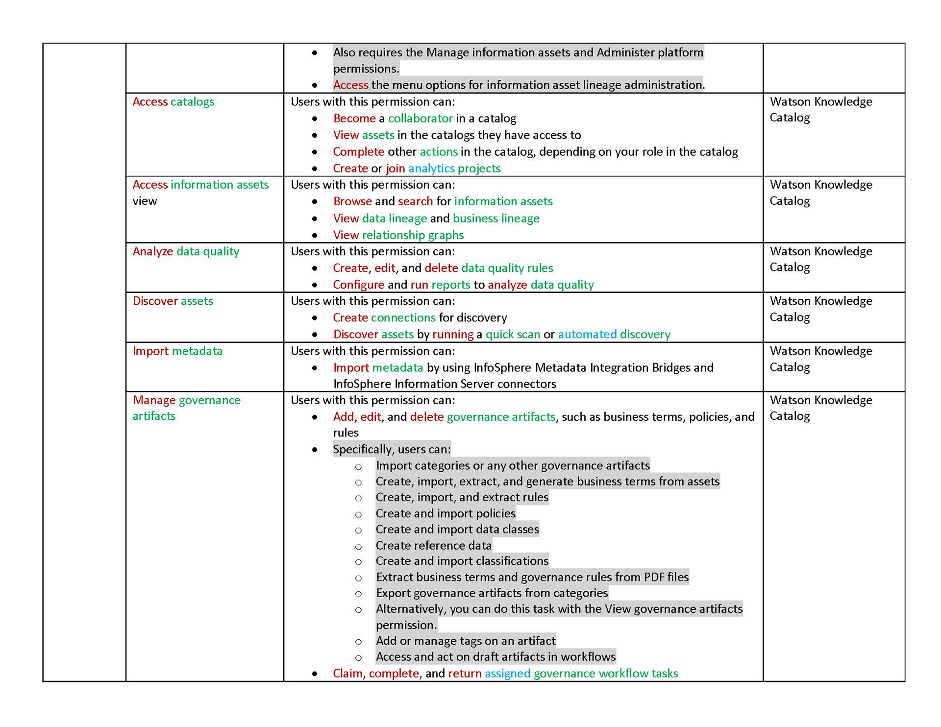
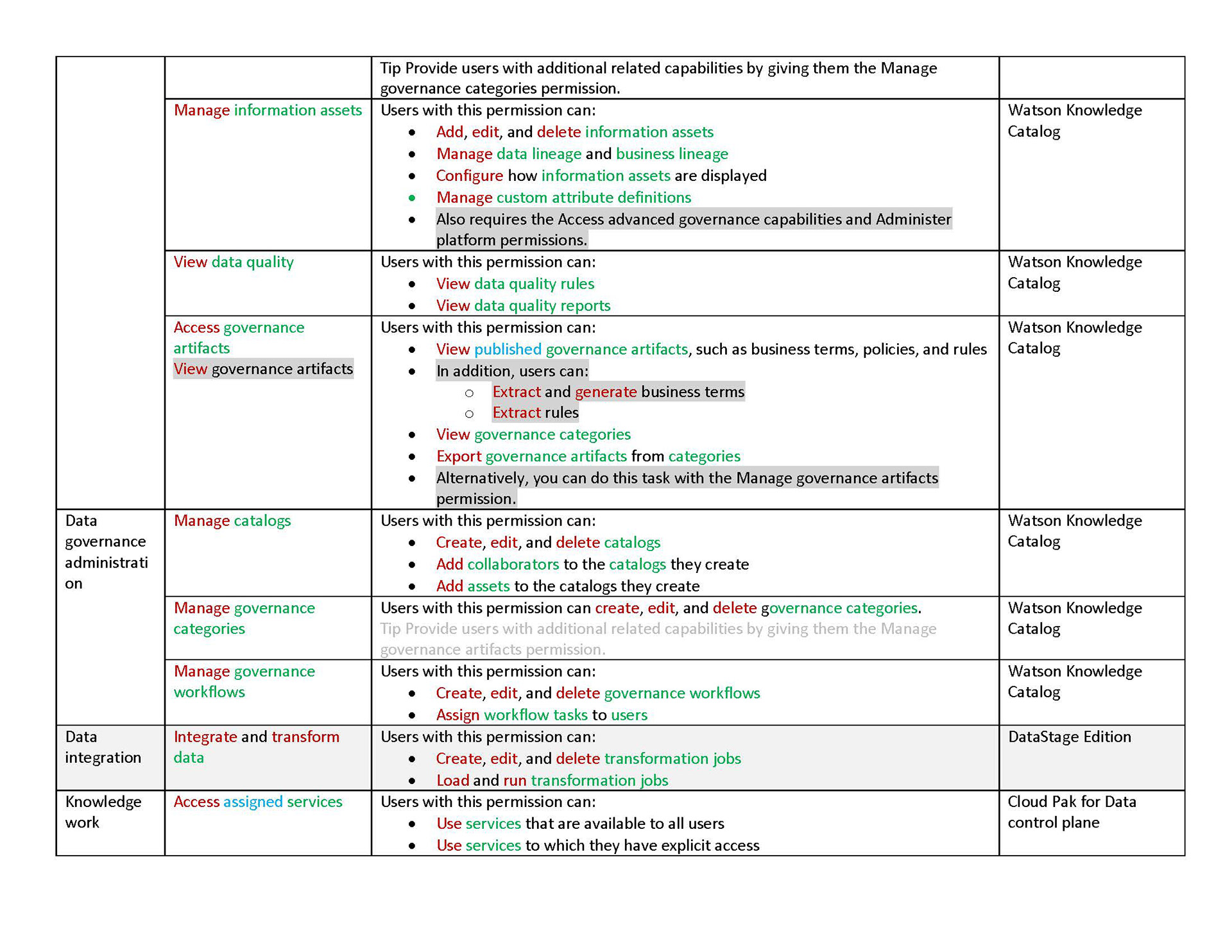
Below, you will find an excerpt of the delivered deck that outlines the net differences that need to be implemented in Cloud Pak for Data 4.0 and all the content needed to populate the new UI.
Guidelines
The delivery document then closes with a guidelines section. I described every piece of how the content for permissions should be written and understood.
Outcomes
The UX flow for creating a new role
In the screen recording below, you can see the outcome of the work in Cloud Pak for Data 4.0. You can see the content and UI at play in a simple example of a role being created.
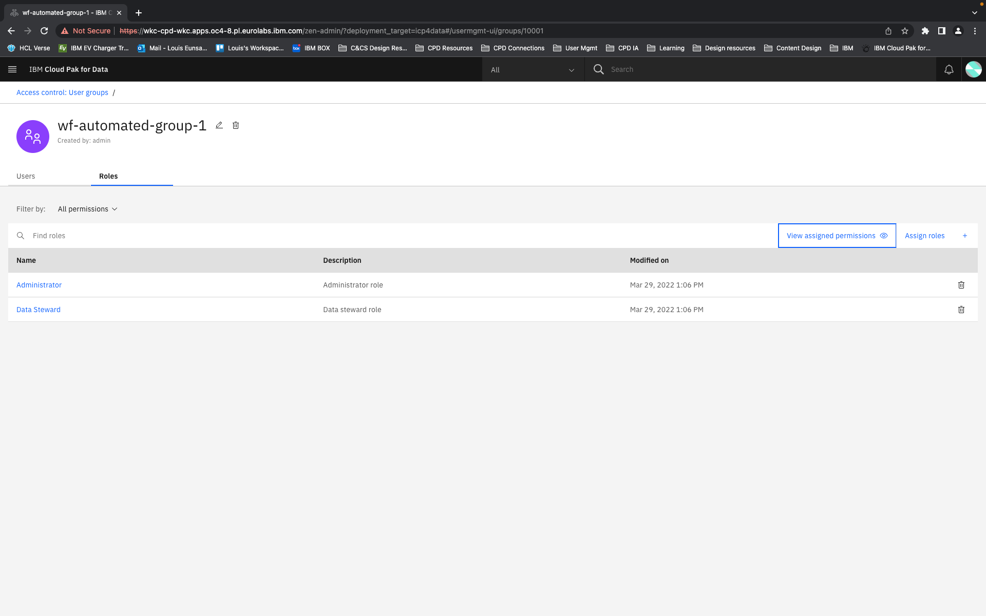
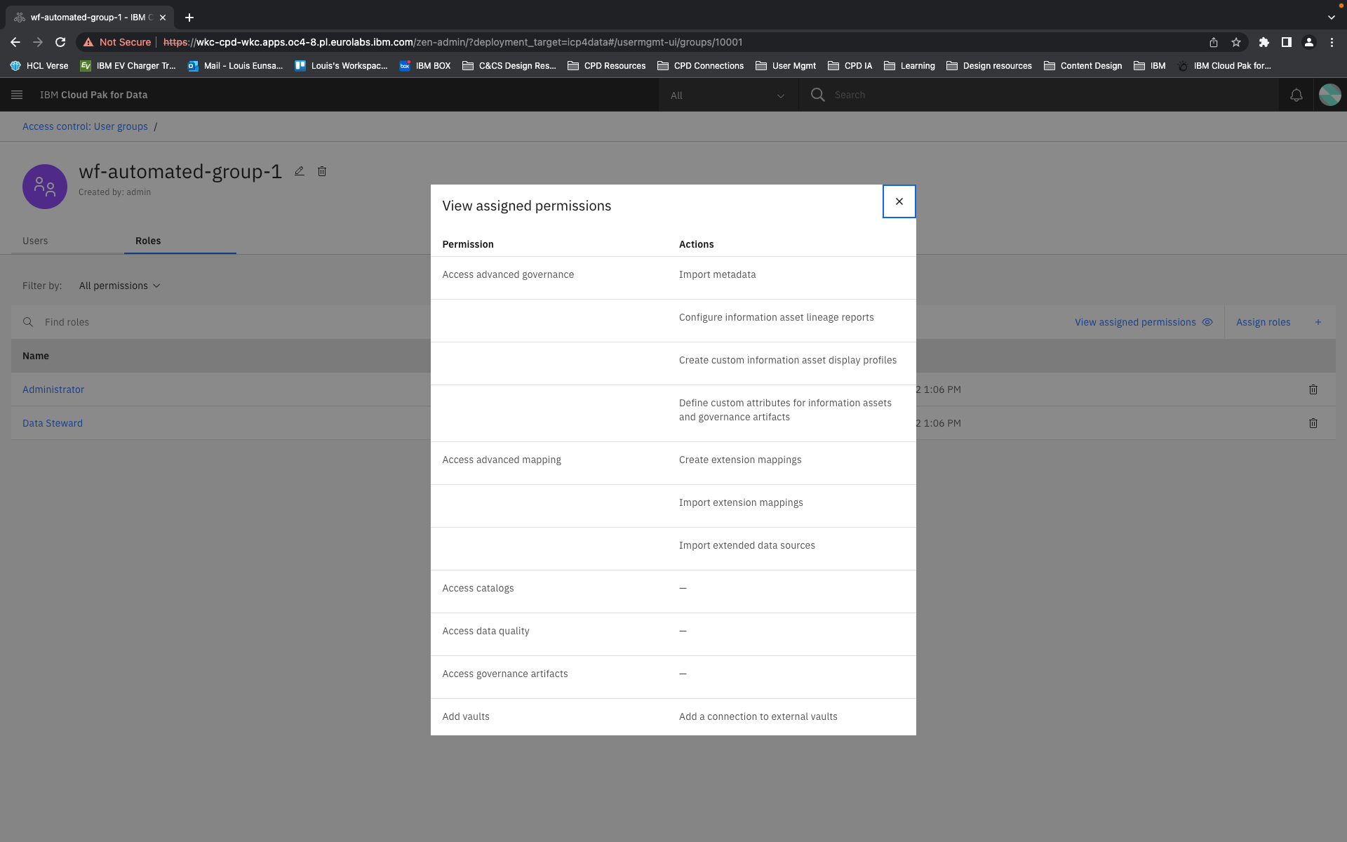
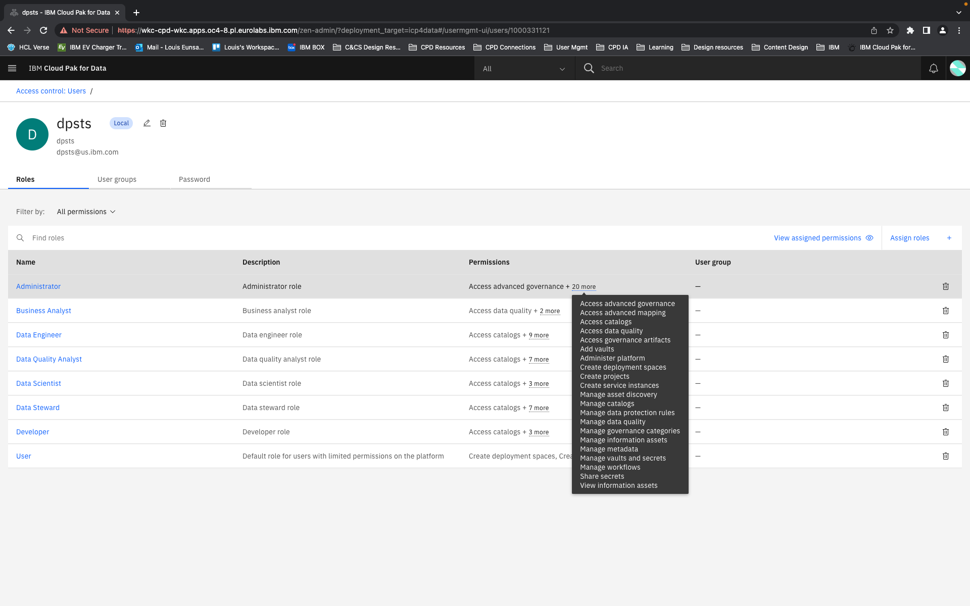
Wider RBAC user experience
Because this is a content system, it's not only in a role creation flow or in an object browser pattern that the permissions content is at work. As can be seen in the following screenshots, the layers of content continue to help users understand what roles are crafted to do and how multiple roles accumulate multiple permissions and aggregate many individual actions. From varying views the administrators and managers have access to progressively disclosing levels of detail that they can explore.
Documentation
While I had crafted permission labels and actions and tooltips with the UI in mind, it exceeded even the detail and accuracy detailed in the documentation that much of it was adapted and used in product documentation. Click the button below to visit the permissions page in Cloud Pak for Data documentation.
Impact
The work our team had done not only made significant improvements to the user experience for administrators on Cloud Pak for Data, but it also had further implications across other Cloud Paks. Some of the core pieces of the platform experience including access control was then being packaged for adoption across other Cloud Paks for automation and integration. So while their permissions would certainly be different, our UI and our guidelines for content and structure was then adopted in these other platforms.
Project Feedback

Feedback given by Cloud Pak for Data platform architect Matthew Wall.
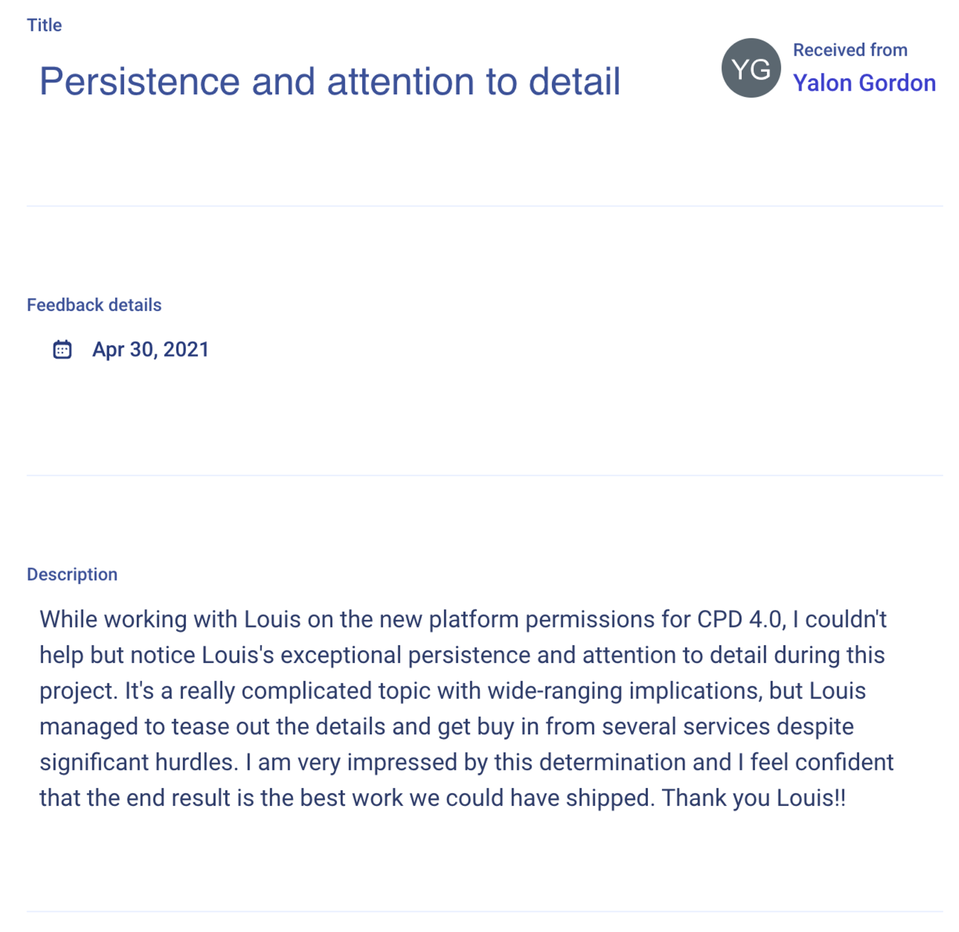
Feedback given by Cloud Pak for Data platform PM Yalon Gordon.